blog posts

street photography tips, london street photography, london photography

My top tips: Conversation with Valerie Jardin on Street in Focus

After celebrating one year in existence, Valerie's fantastic podcast on street photography continues to inspire many more photographers every week. This is why I was so thrilled when Valerie invited me to discuss my top 10 tips for street photography, in an episode turning into an intense conversation between two passionate French street photographers :)
Together we discuss the following 10 Street Tips at length on the show. Enjoy!

  1. Learn to see the light
  2. Search for the mood
  3. Simplify, simplify, simplify
  4. Forget the technique
  5. Know your city upside down
  6. Never lose focus
  7. Become fearless
  8. Embrace mindfulness
  9. Fail often, try again
  10. Make up your own mind

Link to the podcast: Street Focus Episode 55

Street Photography workshop in London // Oct 24th

I am pleased to announce my first London workshop on Saturday, October 24rd, which will focus on storytelling in street photography. Read below to find out more about this exciting opportunity to take your street photography skills to the next level!

---------------------------------------------------------

When: Oct 24rd, 10am to 4.30pm [+ Google Hangout Critique session one week later]

Instructor: Marie Laigneau

Description: Learn to see differently and capture impactful street images with this full-day workshop led by Marie Laigneau, London-based street photographer.

·       We will start the day with a short talk and Q&A session in a cozy coffee place, before heading down to the wonderful streets of Soho for a full day of practice and learning. During this photowalk, we will break up into small groups and I will provide one-on-one guidance and advice to each student along the way. We will end the day discussing our experience and learnings around a drink for those who wish to join.

·       One week later, we will meet virtually through Google Hangout for a group critique & feedback session lasting 1.5 hour. Each student will be asked to make a selection of their best images for editing and critique. As a group, we will then review individual images, discussing key strengths and potential areas of improvement.  

This workshop is limited to 8 participants. Total costs per participant: £110

To register, please send an email to Marie Laigneau (marie.laigneau@gmail.com

See you there!

Marie

Out of Chicago 2016: Third edition

It's already time to be an early bird, at a very special price. Next year, end of June will take place the third edition of this massively successful photography conference, with even more instructors than this year... And if you sign up now, you can get access for only $199 as well as preferred access to the workshops that fill out as fast as lightnings, trust me.

Like in 2015, I will teach 2 full day workshops on street photography, and I will also make two presentations on Storytelling in street photography, based on my research and analysis so far. But beyond me, you'll have the chance to meet Valerie Jardin, and many other fantastic photographers that will make you dizzy with their knowledge and kindness.

So if you're up for it, seize the opportunity now!

Go to: http://outofchicago.com/presale-for-out-of-chicago-2016/ to secure your seat for next year. Hope to see you there!

Storytelling in street photography: Disrupting the harmony

Tension exists when the mind cannot see what it expects to see to fully understand the story. The idea of “tension” is anchored into the Gestalt theory – a theory explaining how the mind perceives and interprets relationships between elements in a spatial configuration.

So what happens when you deprive the mind from seeing what’s expected? You force the mind to imagine the untold, the unseen. You request viewers to go beyond the frame in order to get closure. You leave open too many questions that viewers will desperately seek to answer.  In short, you create tension - and that, by itself, is a terrific fate, but one that is hard to achieve. The more tension you will add in your pictures, the greater the effort required from the mind: and the more interest will be generated as a result.

Why is that so important in street photography? Because harmony is what we see. Harmony is the ordinary, the mundane, the boring. Tension on the other hand is your storytelling ingredient: it opens the door to the imagination, the possible, the dream. It defies the predictable and the expected. It is your key to the extraordinary.


1.       Altered visual flow

The usual visual flow of an image goes from the left (top or bottom), and extends to the other side of the image, to the right edge of the frame. Harmonious compositions make every effort to follow this natural flow, allowing our minds to travel through the picture with as few obstacles as possible. Subjects will traditionally be entering the frame, “owning” the story ahead, and offering the eyes a path to explore the remainder of the image. However, that level of simplicity is rarely satisfying in street photography, as by far, too expected, too ordinary. On the contrary, the most dynamic compositions will break this flow – resulting in increased effort for the viewer to comprehend individual elements, as well as connection between those elements.

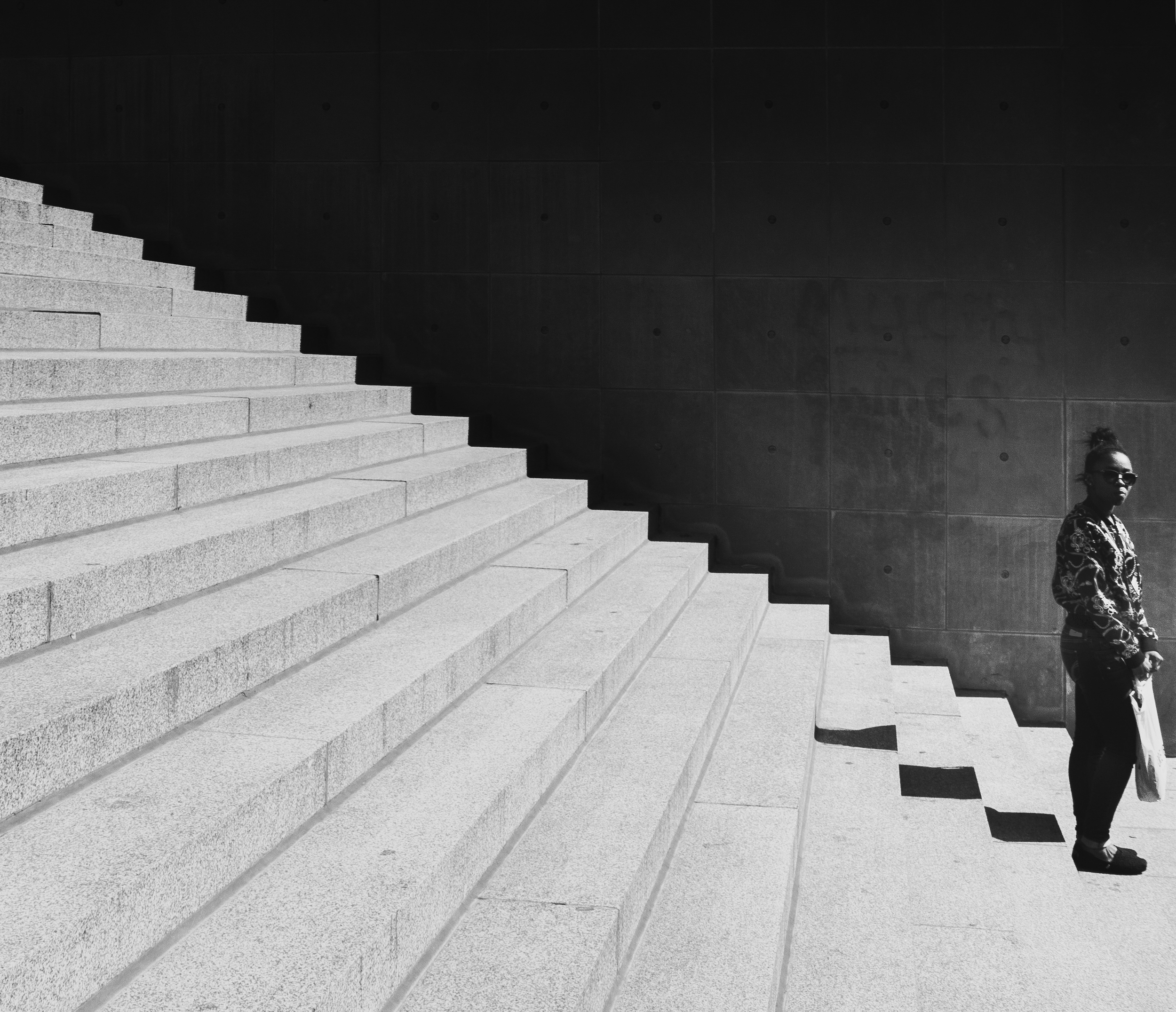
Placing the subject on the edge or exiting

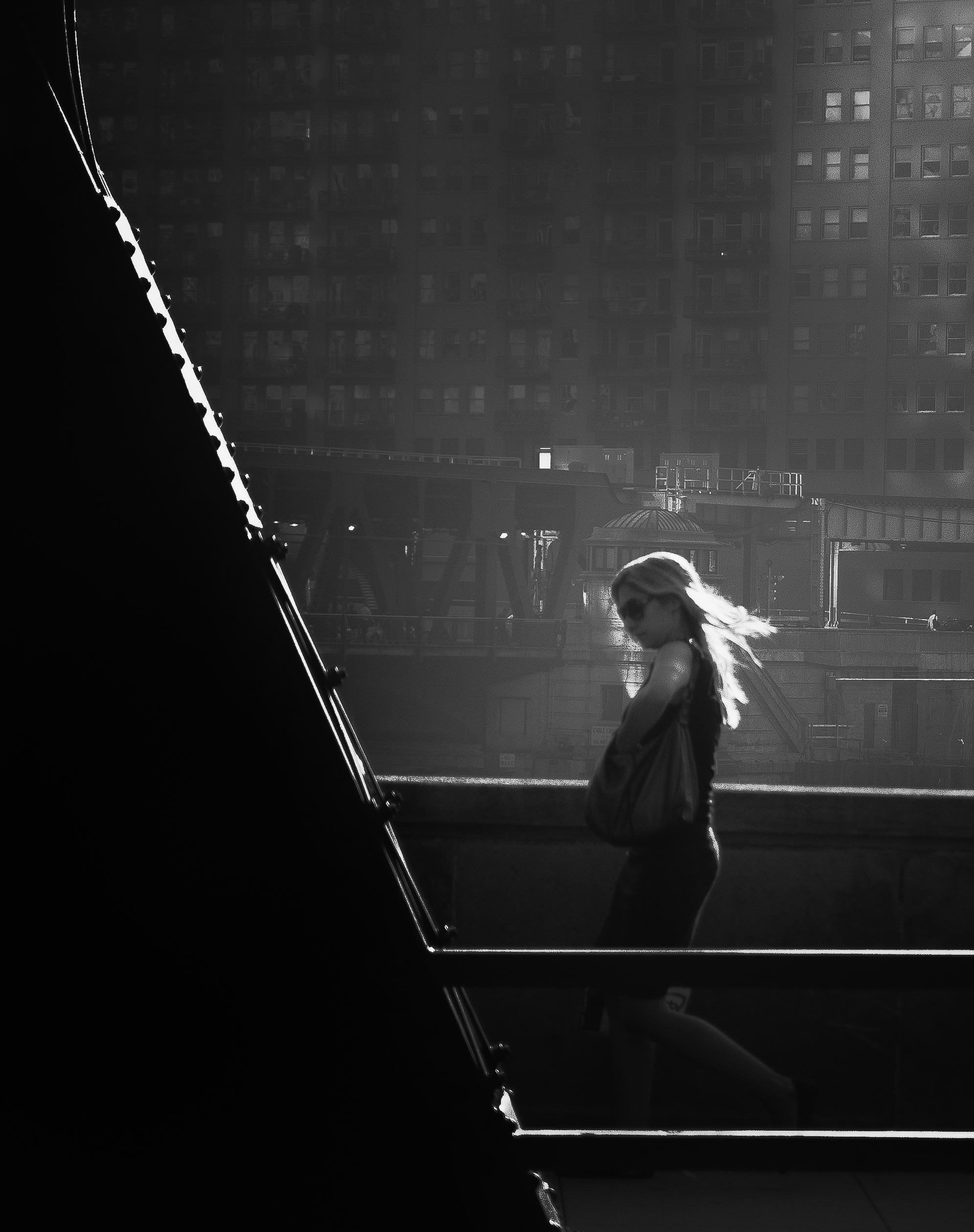
The placement of the subject in this photograph is quite unusual – nearly at the edge of the stairs, and of the frame, the woman appears to stand in a fragile equilibrium. The stairs in comparison stands out by their high graphical impact that the soft lines of the woman hardly break. The result is a feeling of tension – as our eyes repeatedly move up and down, left and right, in search for the lost harmony.

Using invisible lines

Invisible lines created by human stares are very powerful – more so than static elements. Invisible lines make this image complex at several levels. First, the power of the subjects’ stares is strong because unobstructed. The woman clearly looks on the left, to something located beyond the frame. This not only adds tension to the image, but also contradicts the natural visual flow. Secondly, the boy is starring in our direction, whether at us directly or at the woman. This creates a triangular configuration which is very dynamic, and largely contributes to the overall effect of tension here.


2.       Dynamic subjectivity

Angles and points of view, as I have mentioned previously in this book, can make a scene appear very subjective to the viewer – drawing him or her into the action, right at the forefront of the scene. Tilted orientations, close ups, low or high-level angles, as well as direct eye contact can all contribute to powerful subjectivity, creating deliberate tension. This can have a strangely disturbing effect on the viewer, who, from invisible observer, is suddenly propelled in the story as an active player. Dynamic images often use those artifacts, supplementing composition within the frame with unusual, deeply subjective viewpoints. The result is altered perception of the reality, a sense of belonging to the scene, and personal association with the story taking place.

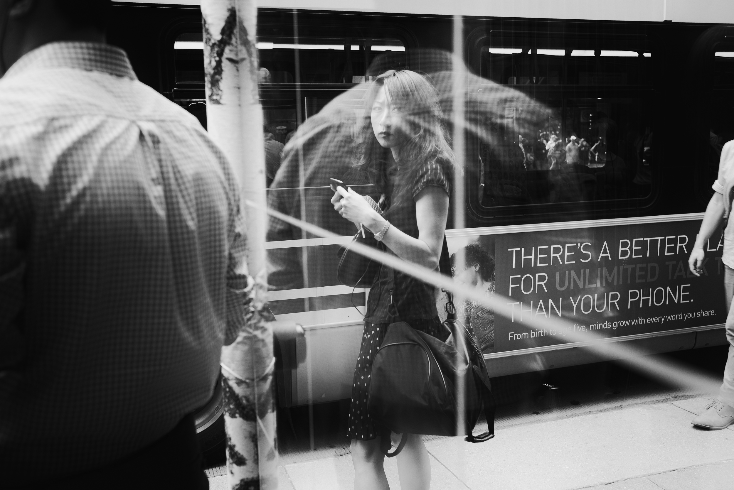
Connecting with eye contact

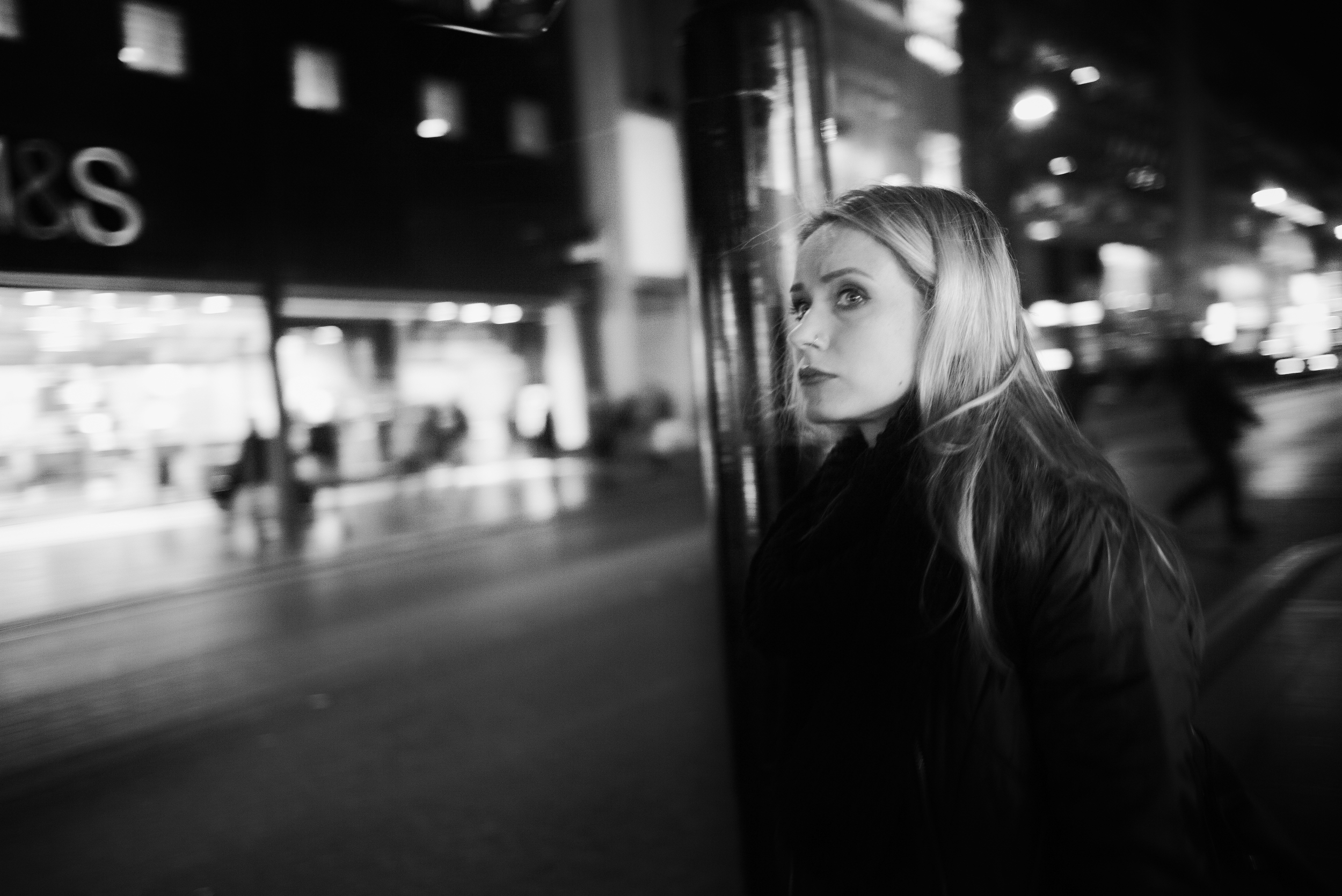
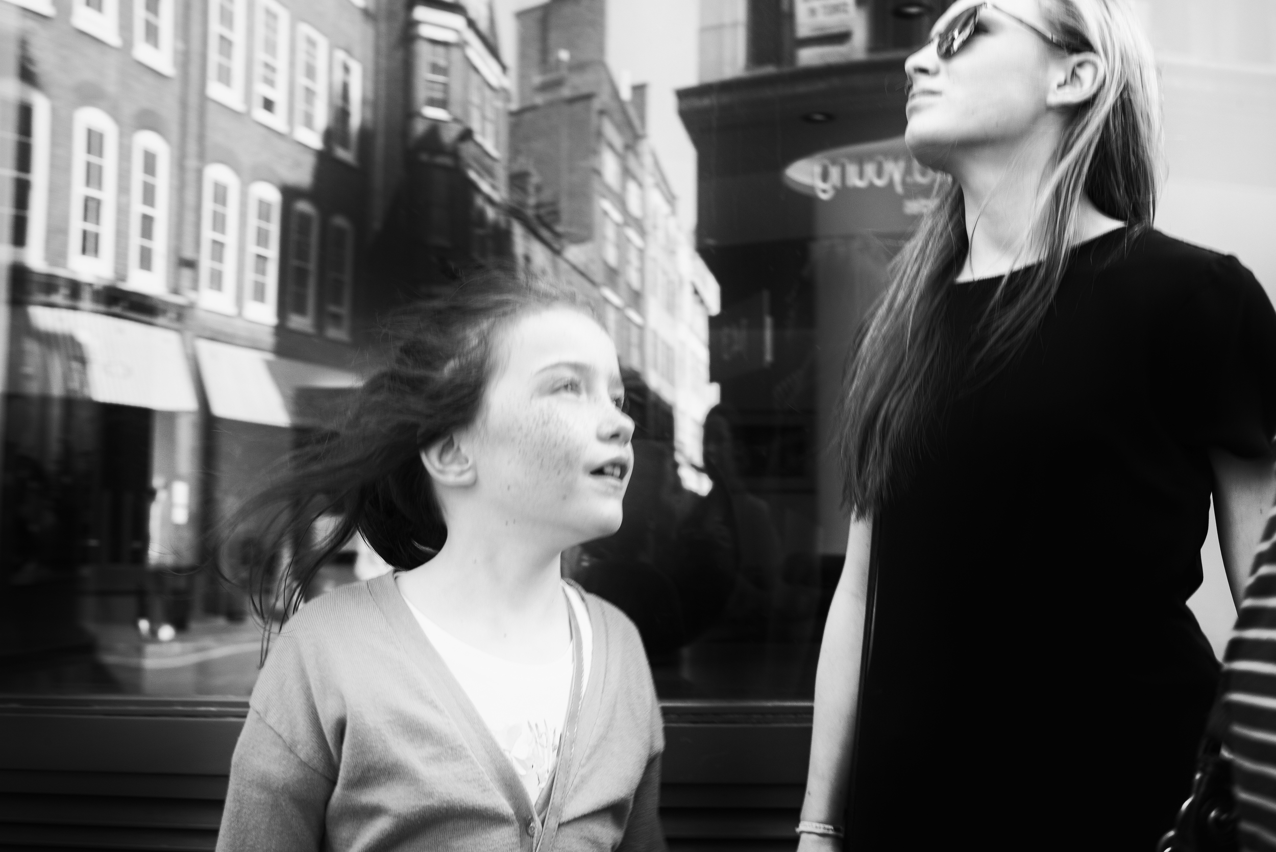
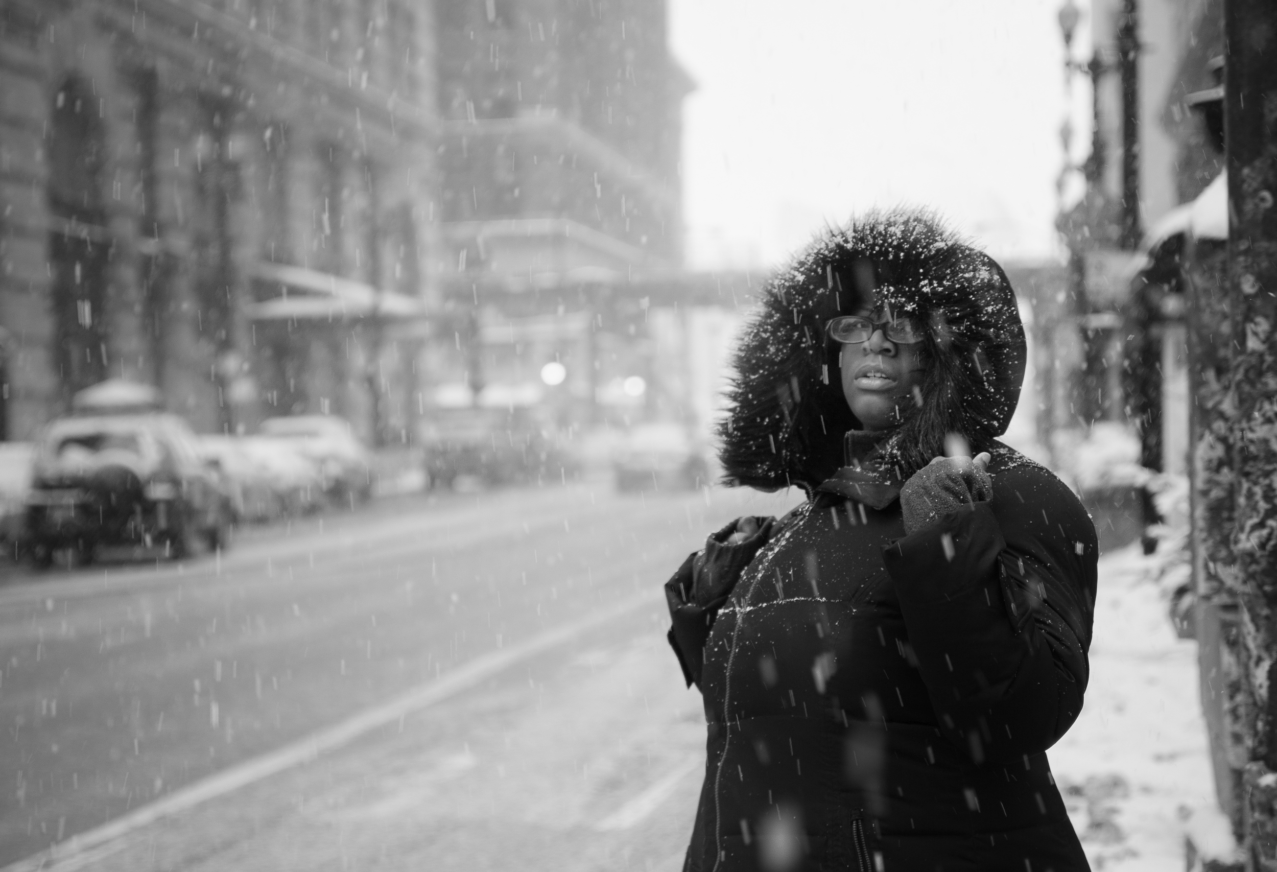
Direct eye contact can establish a strong relationship between subject and viewer. The traditional separation between art work and people viewing the artwork becomes blurred. The mind automatically connects with the eyes of the subject, as if an invisible line was being created between the two. This image is disturbing at several levels. First, the woman’s stare is definitely disapproving of the photographer – and of the viewer, by extension. This creates tension in and of itself. Secondly, the blurred reality created by the reflection of the man on top of her seems to play with our senses – disrupting the harmony of a traditional portrait, while requiring more effort to be understood.

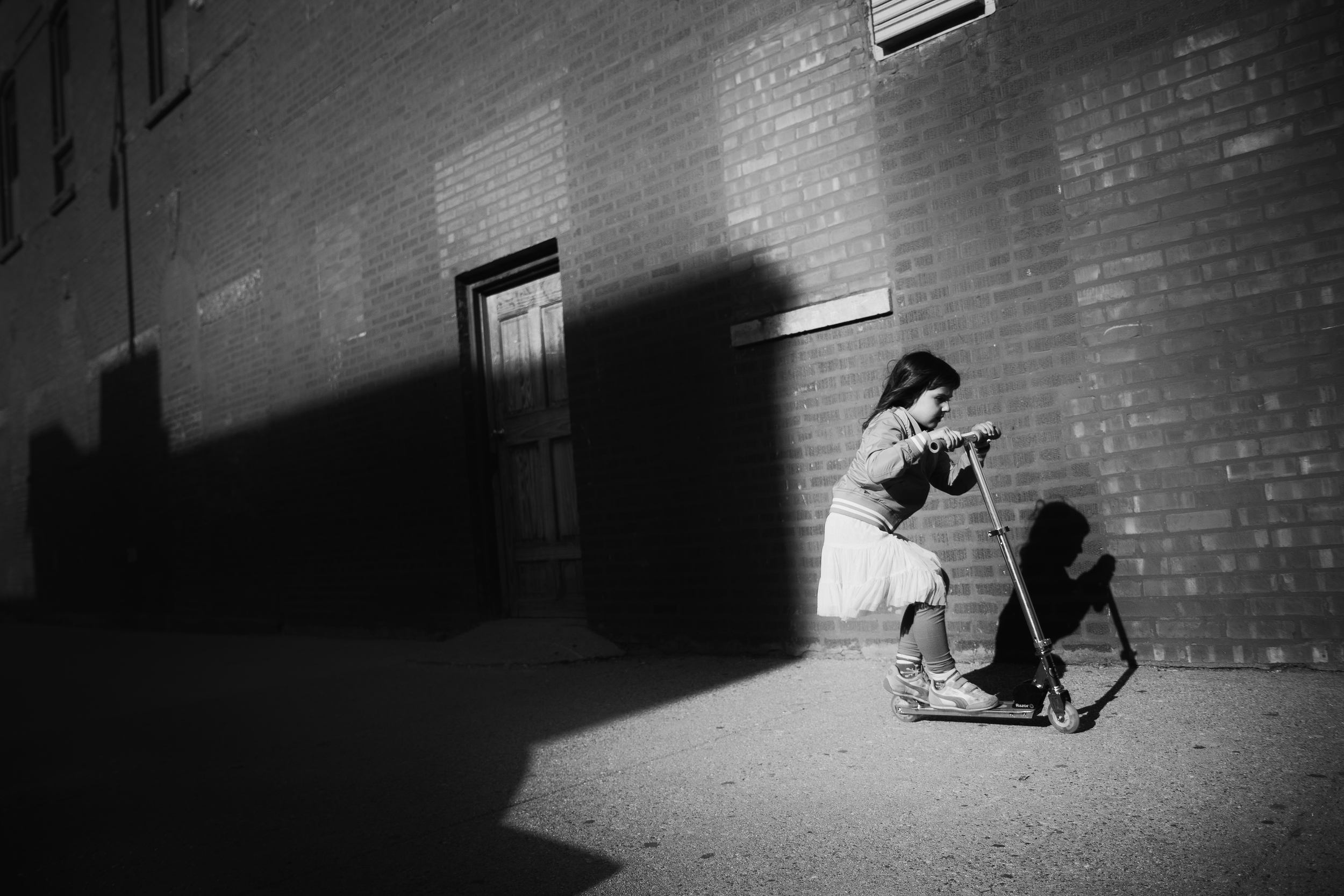
Creating experiential moments

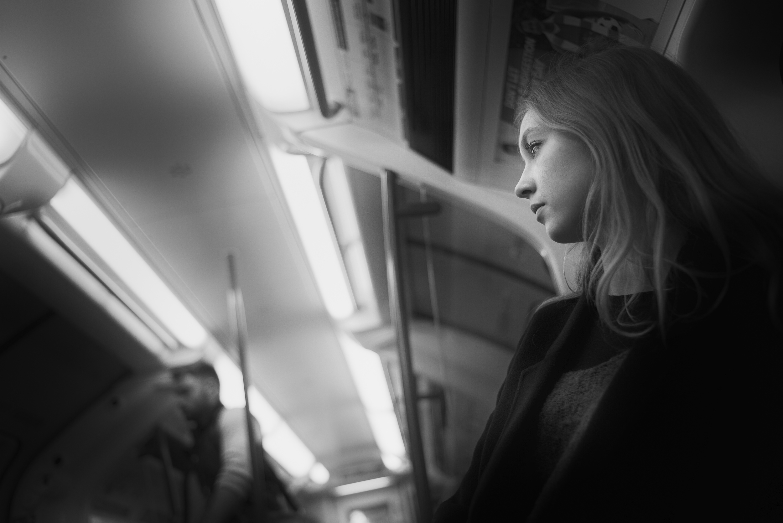
Subjectivity is a key element of dynamism in this image: choosing the right angles and viewpoints will get you a long way in creating unique pictures. The low-level angle at close range, coupled with a titled orientation, puts the viewer at the forefront of the action. Additionally, tension is created by the large mass of blackness that seems to follow her. Finally, the fact that the little girl is exiting the frame – not entering – suggests almost an escape, a frenetic attempt to run away.


3.       Subject minimization

Traditionally, good composition is meant to direct the eye to the subject. Everything we do is aimed at separating the subject from the foreground AND background in clear, indisputable terms. Let’s think about what it means to break that rule: what if my subject cannot be easily distinguished from the environment in the photograph? What if your subject appear lost within their massive surroundings? Then discomfort comes in as the mind cannot properly process what’s going on. The original distinction between subject and environment doesn’t really exist – one and the other are interchangeable, part of a bigger scheme. It will demand more effort to understand your picture. And in many instances, more effort equals deeper interest.

Giving a sense of exaggerated proportions

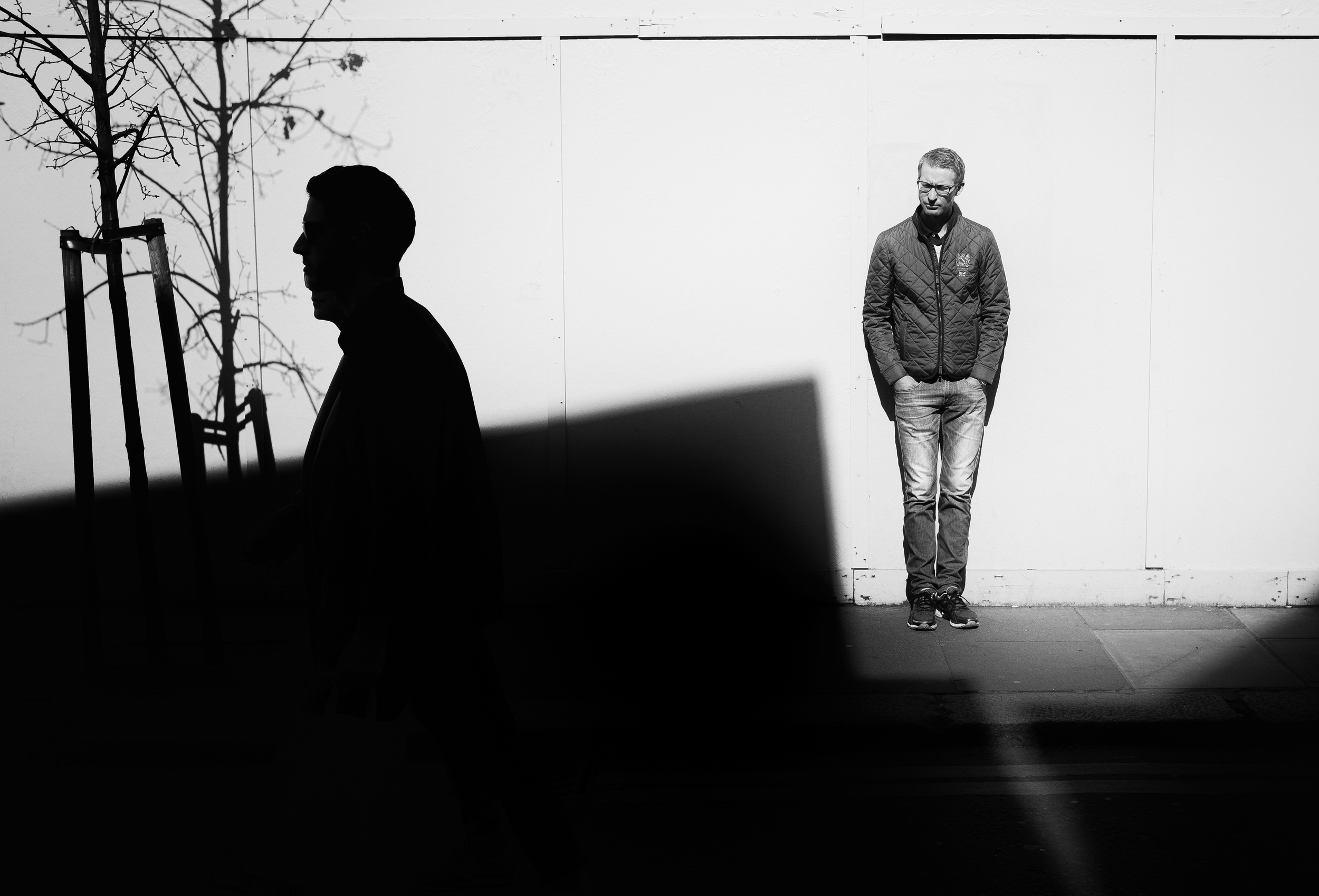
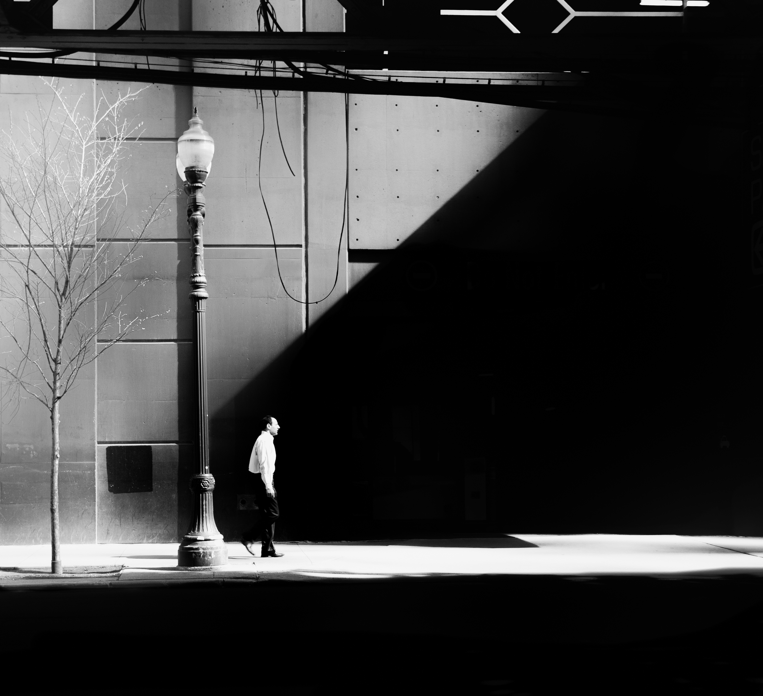
The image is all about exaggerating the proportions of the city in comparison with the subject. As you can see, the size of the lamp post as well as the massive triangle of pure black position the subject at the very bottom of an extravagant urban structure. The man appears lost in this urban jungle, faced with a never-ending wall of blackness, and surrounded by large pieces of steel. Even the tree seems frail and vulnerable compared with the tall lamp post. This resulting sense of scale adds tension to the image, suggesting that the subject is, in a sense, at the mercy of the overpowering city.

Blurring the line between figure & ground

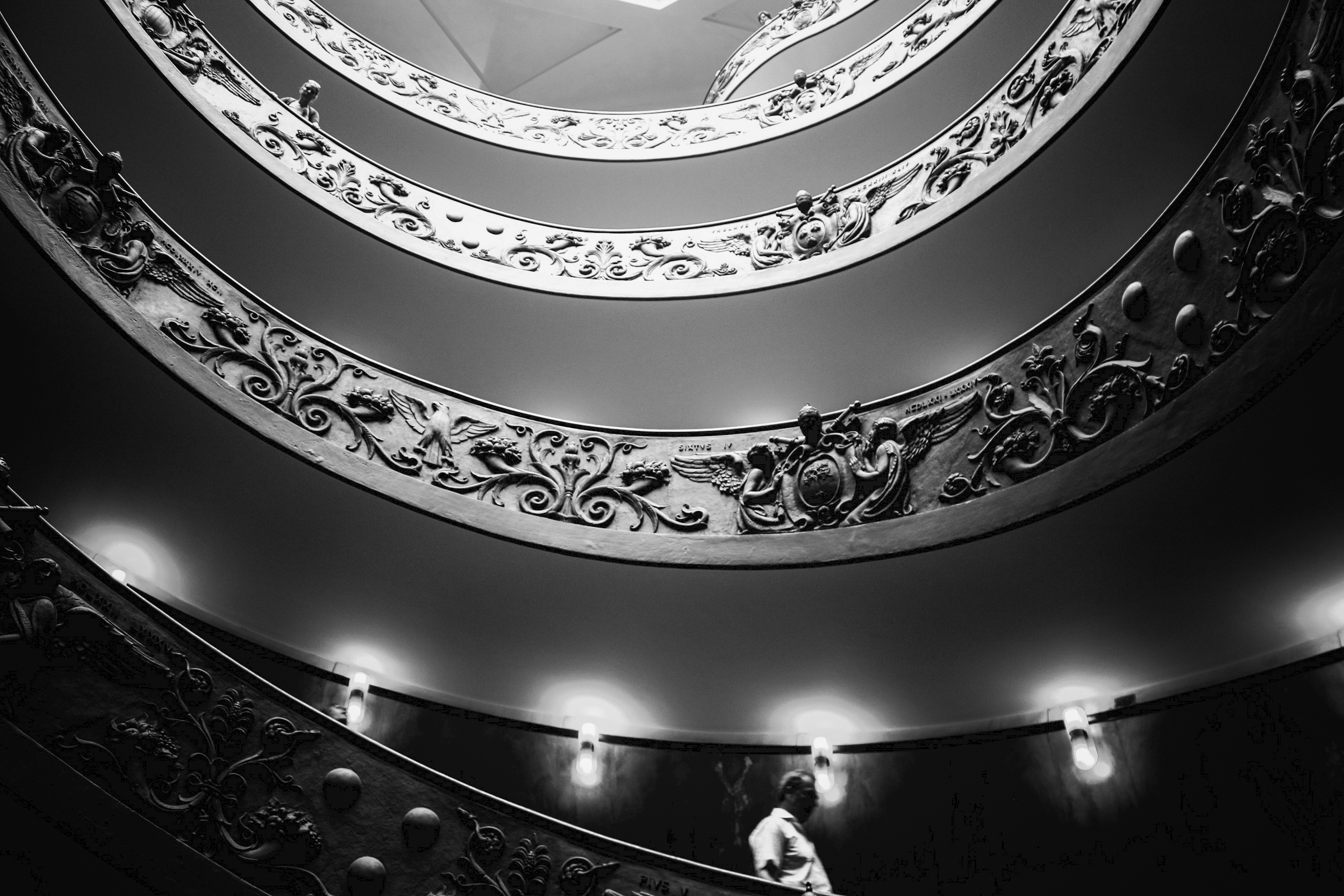
In The Stairs, the man is quite visible at the bottom of the picture. But as the eyes travel up to the top of the stairs, the difference between ornamental objects and human figures become increasingly blurred. Are these men looking down at us or are these vestiges of the past? Blurring the lines between figure and ground forces viewers to re-evaluate the image a second time – and perhaps, get lost in the labyrinth of possibilities.


4.       Open-ended stories

The human mind needs closure. There is a need for a beginning and an end to everything. In fact, the human mind cannot easily tolerate gaps, nor can it be sustained with allusive answers. This is why playing on that weakness can be surprisingly successful in photography and art in general. The resulting ambiguity is intolerable, and in order to make sense of the whole, the mind is forced to fill in the gaps, making its own interpretation of the scene and the story. As we can expect, this requires effort, and effort means increased interest. And this is perhaps the most important insight to remember: suggesting stories can be far more impactful than simply telling them; it allows the viewer to make it their own, and their own only.

 Keeping key elements in the dark

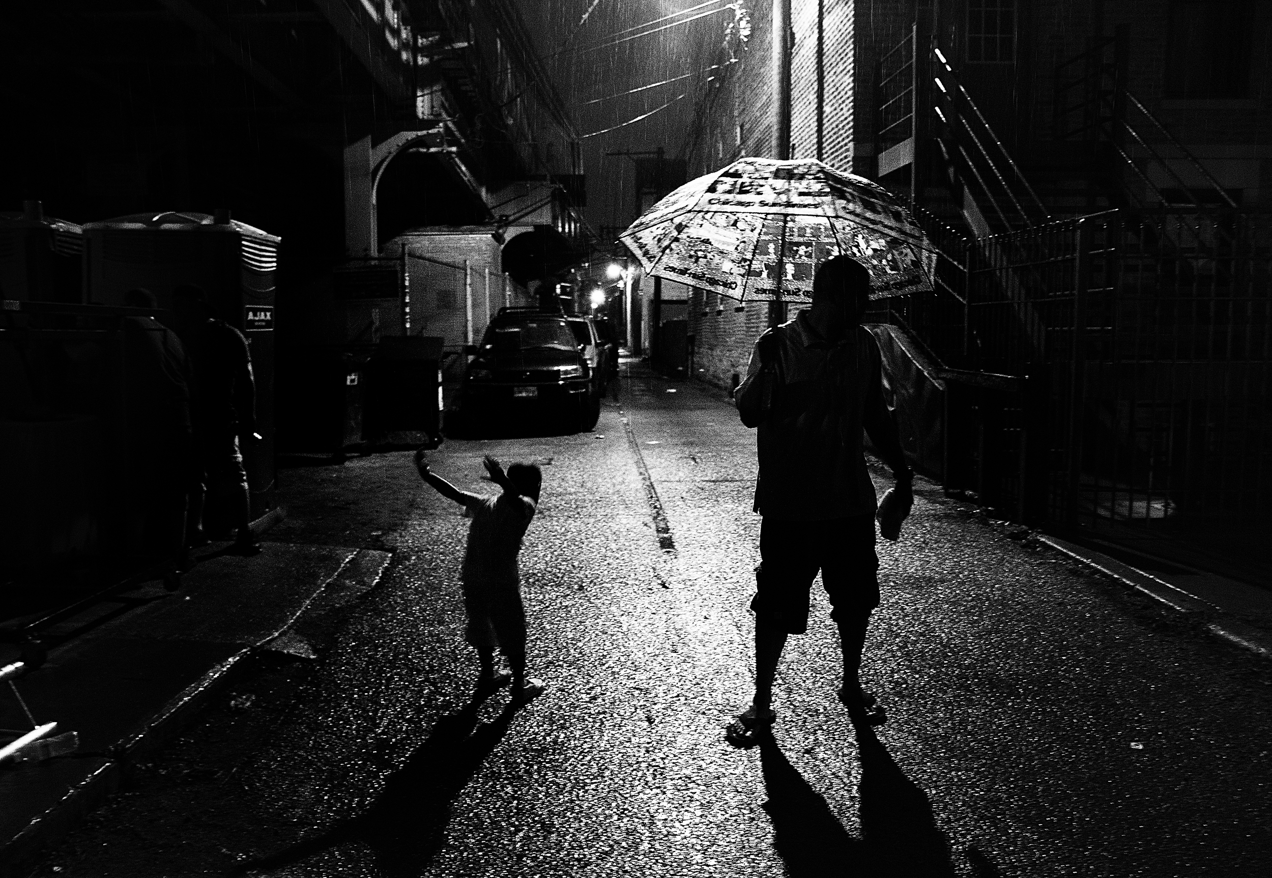
By hiding key elements of the scene, or key features of the subjects, we are in fact inserting gaps in the story – something that the mind cannot accept. This image has been interpreted in so many different ways, since I shared it publicly. The reason is simple: it only tells half of the truth. The subjects are mere silhouettes, whose expressions is hidden and can only be imagined. While the little boy appears to be jumping around, the gloomy light sitting across the dark alley conveys a feeling of ambiguity to the story – revealing too little to establish a clear and common storyline.

Not providing all the answers

This image doesn’t tell a story, it only suggests one. The subjects are looking up at something located beyond the frame, and for this very reason, the story remains a mystery. This results in a more engaging image, left to the imagination of the viewer. What can they be looking at?

There you go. This was the last chapter of my first eBook, Storytelling in street photography – Creating impact. Soon I will publish the second volume of this series, entitled: Understanding the human and city relationships, providing a unique perspective on composition and storytelling. Hope you’ve enjoyed the reading, and I wish you a lovely day full of photographic surprises!

Storytelling in street photography: Transforming with light

Light – and the absence of light – is inherent in all photography. Photography literally means: “Writing with light”. The amount of light coming in your sensor will ultimately determine what your image will look like from an exposure perspective. But light is far from being neutral – it shapes your image, it emphasizes your story, and can ultimately transform the reality to create new worlds as mysterious and powerful as those found in our dreams. Knowing when and how to use light is key to creating greater impact with your photography.

In this chapter, I explain and analyze 4 different effects that light can have on your image and your story, looking at it as a continuum: from very basic tonal differentiation to radical light transformation. The transformative power of light has no limit - it is a world of possibilities that I encourage you to explore. Now.

1.       Creating separation

At the very basic level, light acts as a separator between your subject and the background. Back to the core of our perceptions, the human mind can only distinguish elements in visual art if, and only if, they have different colors or shades of a similar color. In B&W photography, when colors are de facto absent from your composition, the only way to define your subject vs. the background is to create tonal differentiation. In other words, you need to capture elements with different values of light if you want them to be distinct from one another.

Separation: Light subject vs. darker background

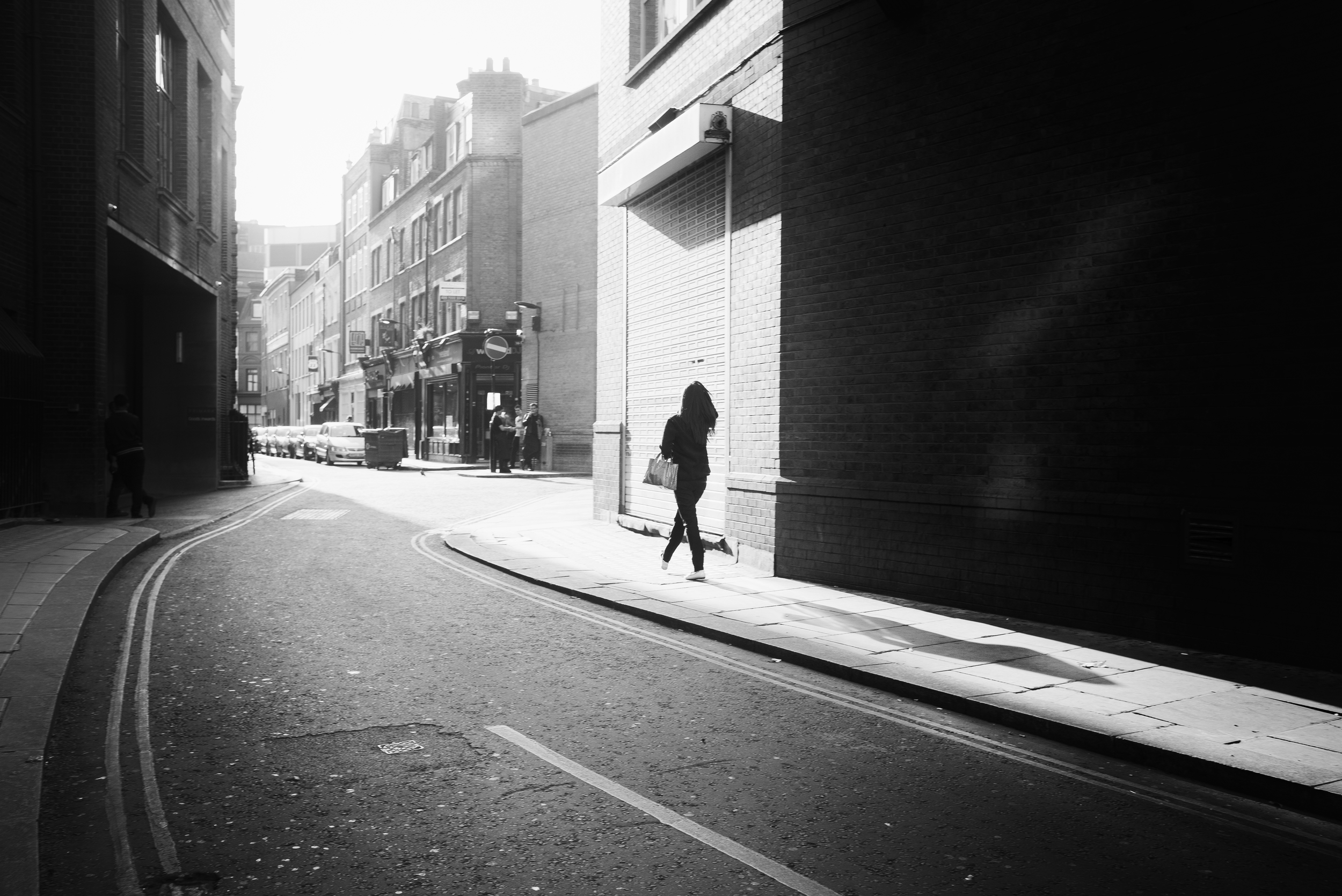
In this image, the lady walking is clearly distinguishable against the background. In fact, I waited for that very moment to take the shot, as I wanted her head and face to contrast against the background. Since I was range-focusing (i.e., using a small f-stop to ensure that a maximum number of possible subjects would be in focus, regardless of their distance from me). Although useful, this technique also brings far too many distractions: foreground and background tend to be a long continuation from another, making it hard to separate the subject from its environment.

Separation: Dark subject vs. lighter background

Tonal differentiation also works the other way, with a darker subject positioned in a lighter background, as in the photograph here. In both cases, the distinction between figures and ground is clear and indisputable, which is the basic essence of traditional composition. The separation in this image is further created by the shallow depth of field, a useful tool to bring up subjects at close range.


2.     Generating emphasis

A more advanced use of light in your composition can allow you to emphasize your main subject. In other words, light can help create better stories if used smartly and appropriately. Think about how light, and its opposite – darkness - can contribute to your composition: leading lines, blockers, frames, negative space. All those elements will support your story by leading the eyes to what really matters – and get rid of what doesn’t.

Emphasis: The effect of selective lighting

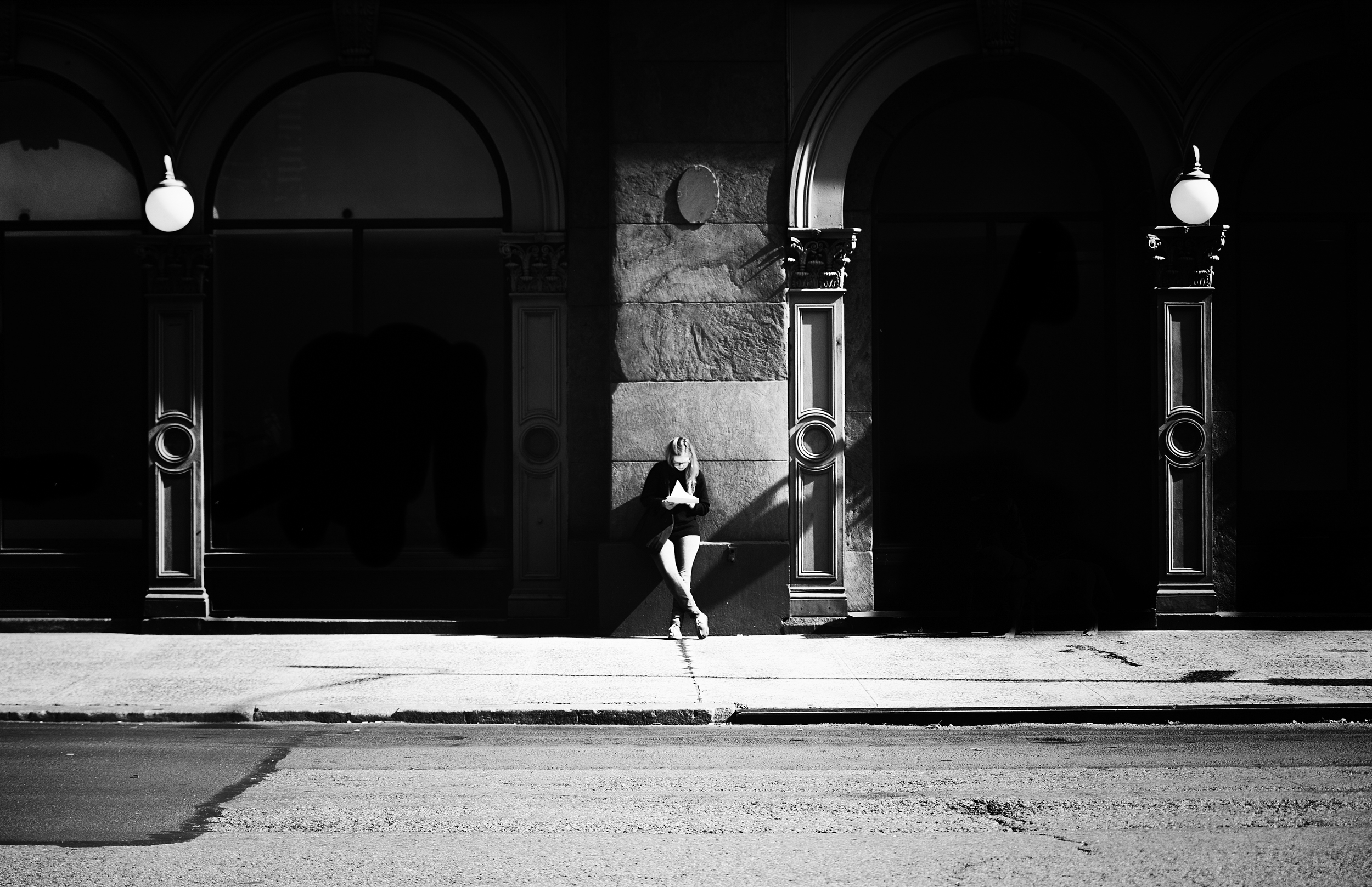
In this image, the use of light is more sophisticated: it shapes the story and the image. By applying light and darkness selectively – in areas within the arcades, I not only clearly separate my subject but also isolate her, thus creating that feeling of silence and strange quietness that seems to fall on her.  The eyes are unmistakably attracted to her, while the exploration of the darker zones on her right and left leaves us wondering what can be hiding behind.

Emphasis: Leveraging negative space

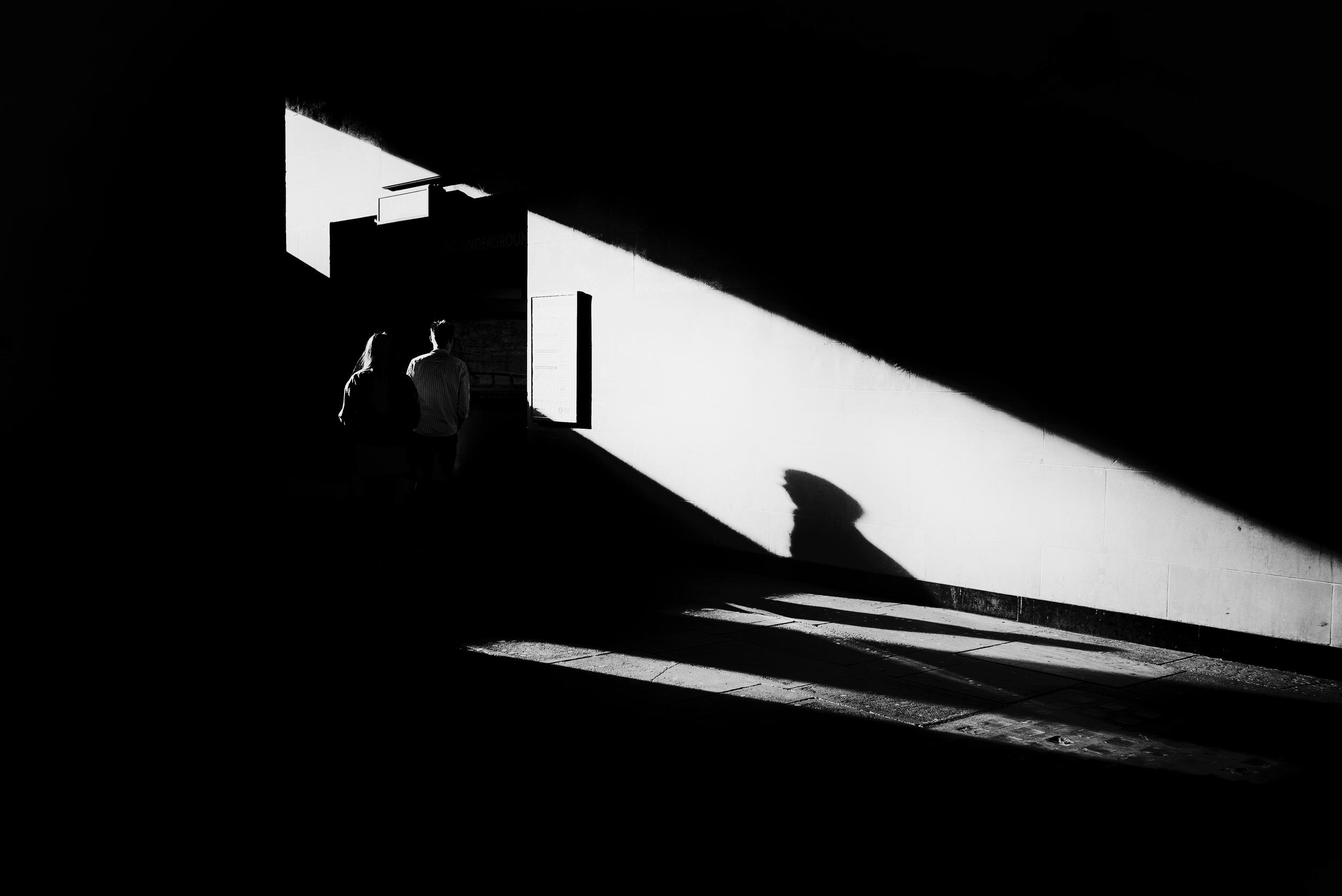
Another purposeful use of light is negative space. Dark negative space brings up feeling of loneliness and silence, while light negative space will generally convey more positive feelings. In this shot, the negative space not only highlights the two subjects, but also brings them in contrast to the wide and empty city behind. The eyes move from the couple to the massive city sleeping behind them, structured and shaped by light and dark. The sense of perspective is amplified by the tonal variations at the center vs. extremity of the city, providing an interesting counterpoint to the couple.

Emphasis: Leading the eyes to what matters

Light can also act a blocker, like that shiny ray of light on the steel of the bridge in the picture below. The line created separates the photograph into two distinct areas: the dark part of the left, where our eyes do not want to stay or linger too long, and the brighter part on the right where the subject stands. As a result, more emphasis is given to the subject, as the eyes are forced to shift on the right and rest on the illuminated face of the woman.


3.       Adding substance

Furthermore, light can create elements of its own – secondary actors that will help you tell a more subtle and powerful story: silhouettes, shadows, reflections. Those elements often convey more mystery and depth to your stories, helping to emphasize underlying emotions in your images. Those elements will create substance if they reinforce your existing story – which means, if they do not contradict the story in place.

Substance: Creating meaningful atmosphere

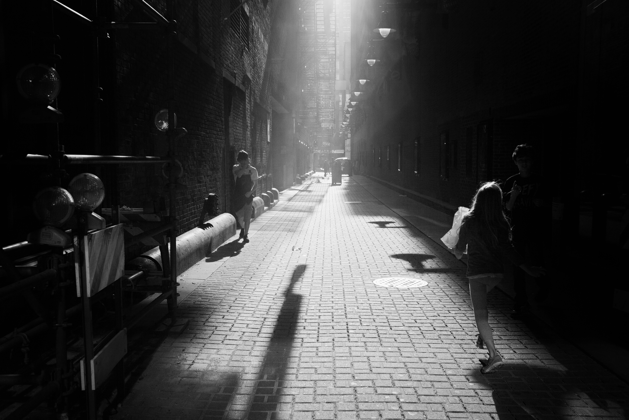
Light can add tremendous substance and depth to the story when it generates additional atmosphere. The light in this image is making the shot: this is because the atmosphere is misty and mysterious that our eyes wonder a little longer. The scene itself and the protagonists do very little to capture our attention, but placed within this explosion of light, they become timeless and memorable, just as the story.

Substance: Capturing stolen reflections

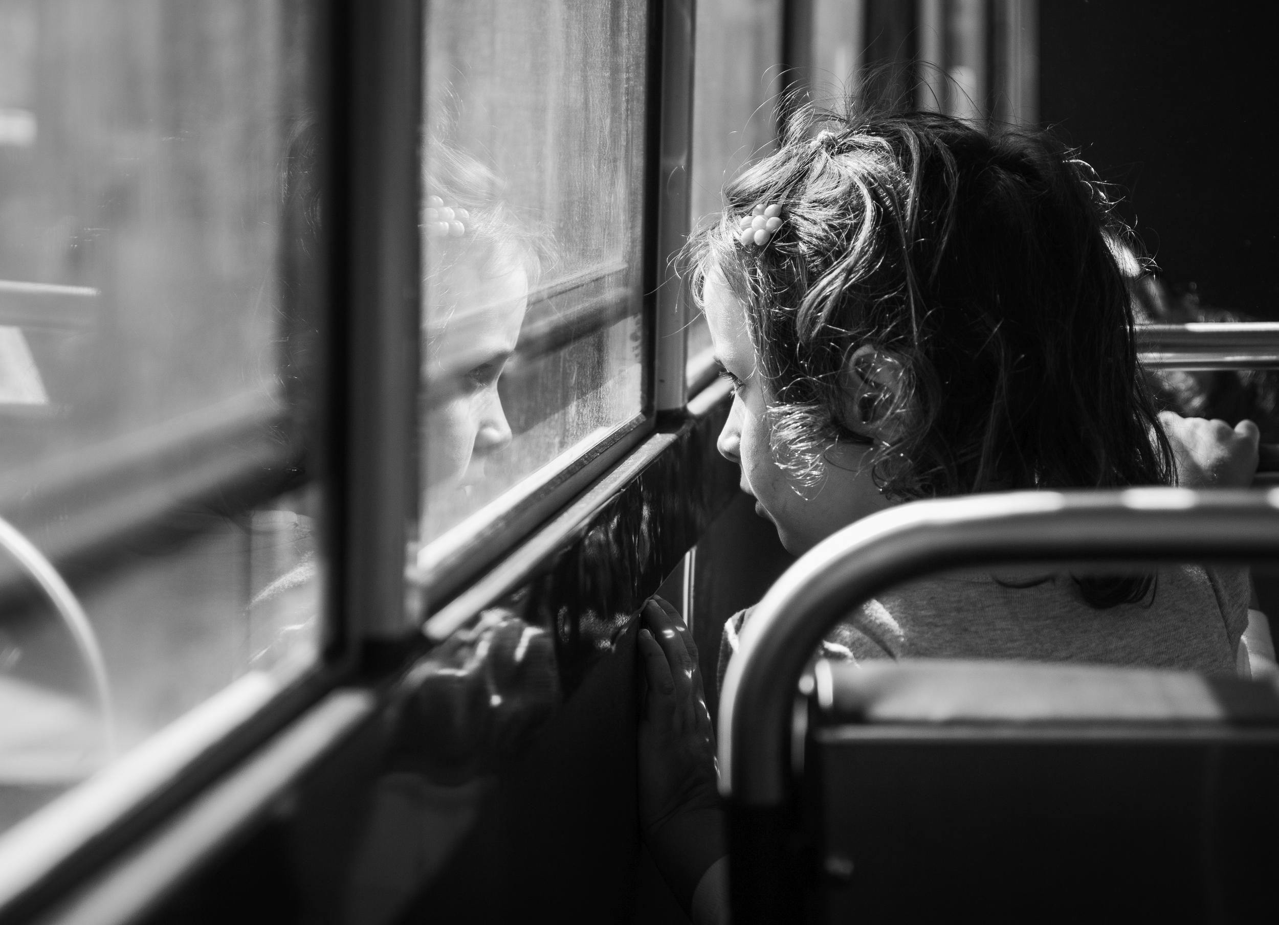
The sun has this wonderful aptitude to create new elements in photographs. Reflections are one of those elements that only light can create, and, if used properly, will add significant substance to your story. In the photograph below, the little girl looking beyond the window is facing her own reflection. Elements respond to one another – as if her reflection was an extension of herself, and extension of hey journey into her mind.

Substance: Shadows as extension

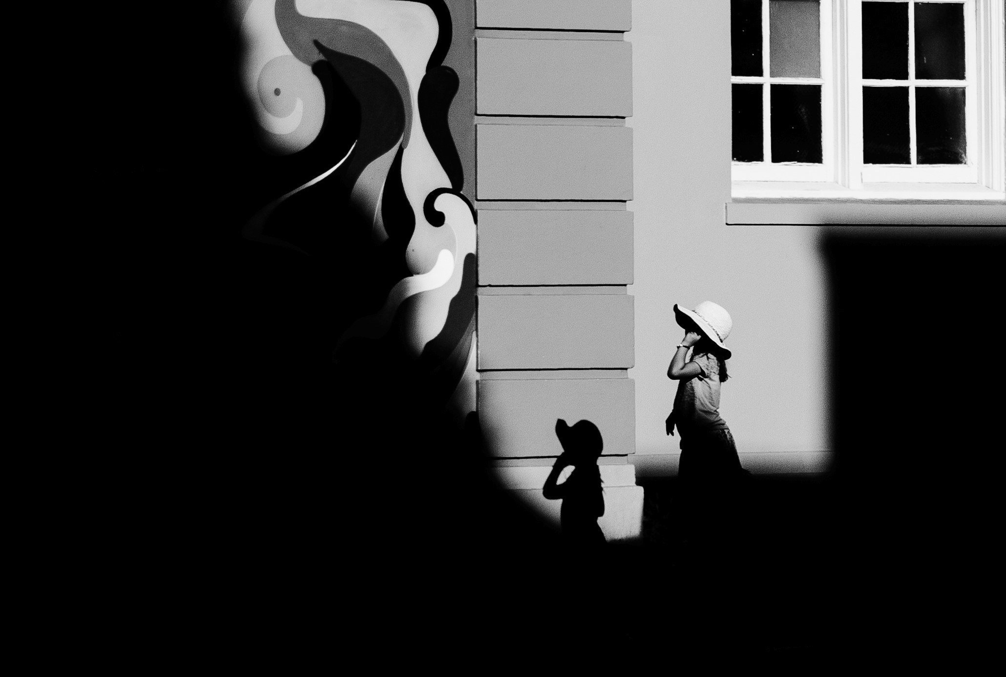
Shadows – that other artifact created by light – have a strong symbolic value. They tend to show that we are dual in our humanity, that there are two of us – the dark and the light, the reality and the dream. In the picture below, the shadow of that little girl is enhancing the story, not creating conflict as we could suppose so. That little girl alone imitates the world of adults as she proudly wears her feminine hat, yet behaves like a child in her attitude and posture. Her shadow and negative space around only enhance that story by offering a representation of that world of hers, of that imaginary place where she stands – bridging the seemingly separate worlds of childhood and adulthood.


4.       Creating tension

The most powerful impact of light that can be found in photography is to create meaning. When new elements created by light – or absence of light – detract and contradict the story in place, you are in fact creating new meaning. This is probably the most interesting and inspiring use of light for street photographers. New meaning will be created if, at the end of the day, elements with contradictory meaning come together to form a greater whole. This is the power of opposites – stirring emotions in multiple directions to create, ultimately, meaningful tension.

Tension: The opposition of light and dark

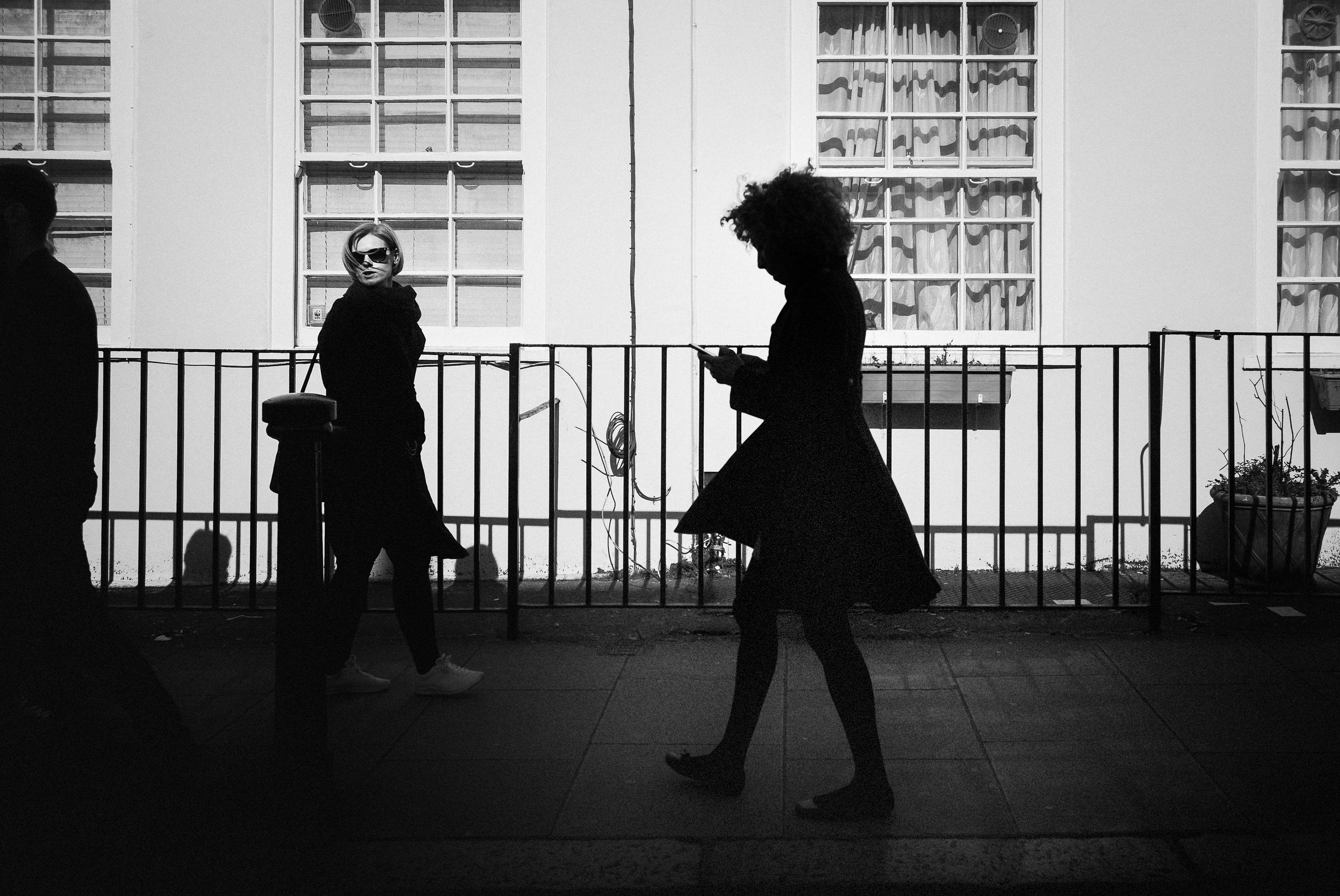
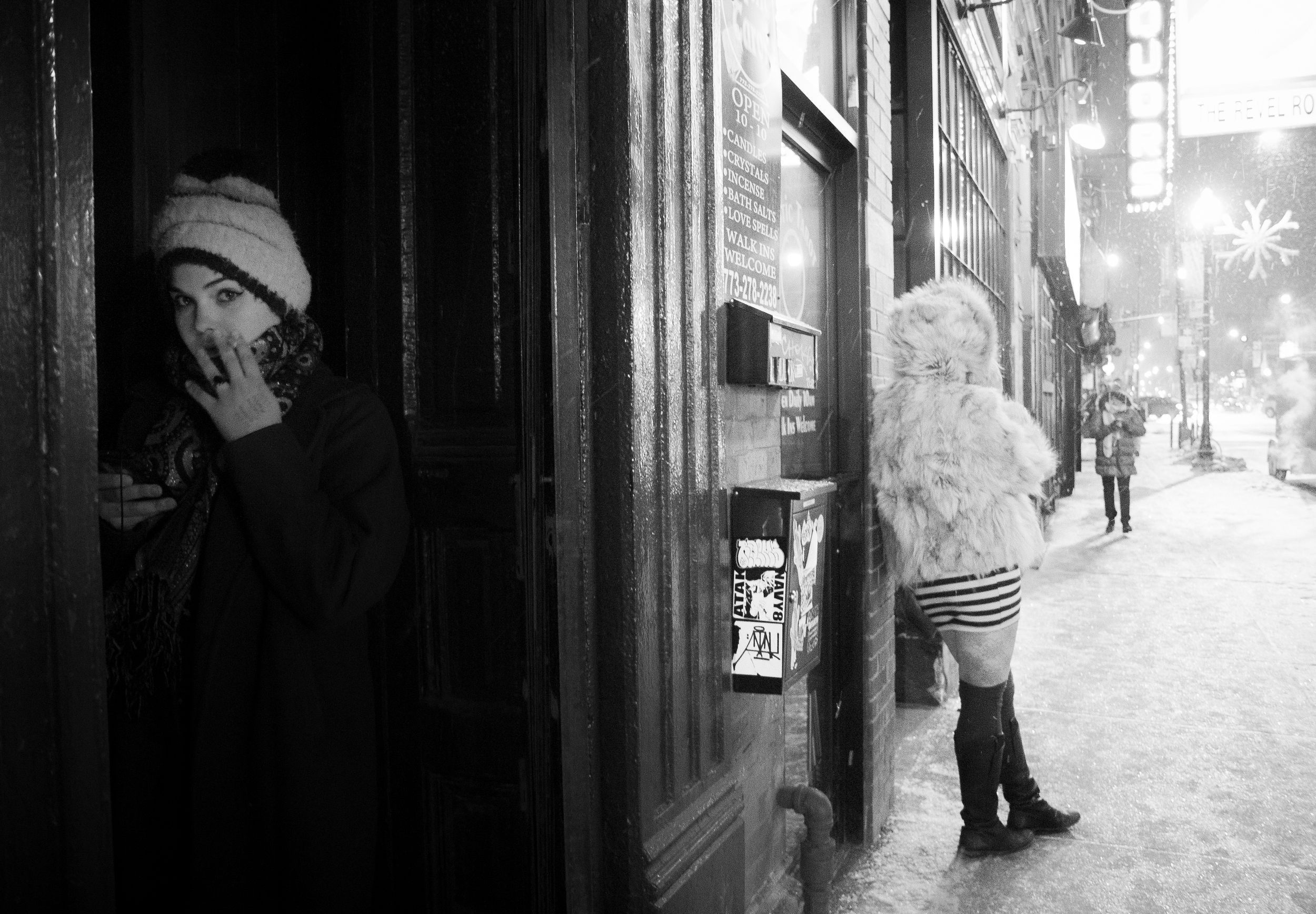
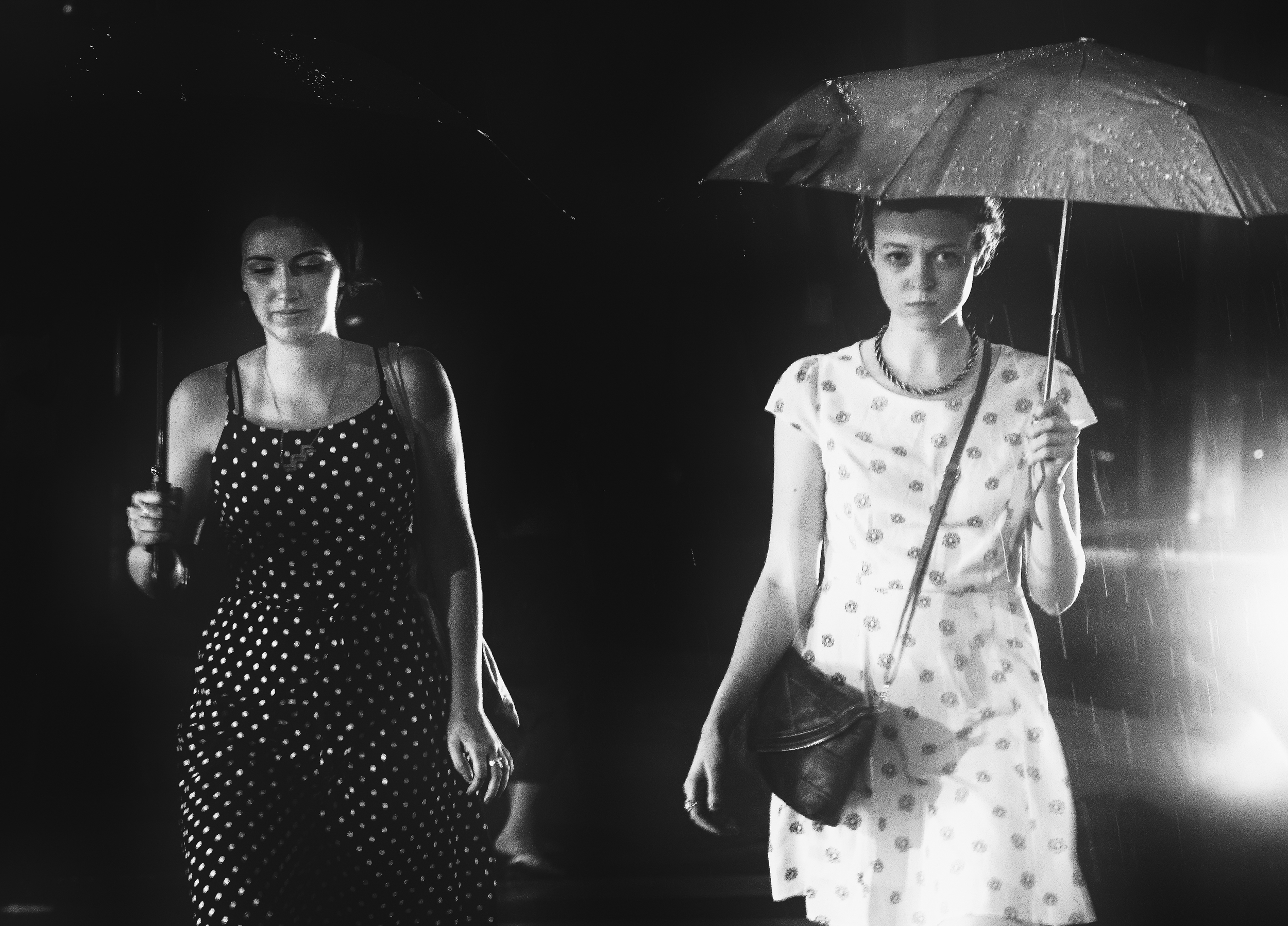
Tension is born out of the confrontation of opposites. Light and dark are in constant opposition with one another, and are associated with opposite feelings as well, as we already discussed in this article. In the photograph below, elements created by light do not act as an extension of the characters, but appear in total contradiction. The beautiful woman rests in the dark, while the strange-looking woman with naked legs is in the light. This inherent contradiction creates a feeling of mystery: the beautiful woman is not who she seems to be. From that dark corner, she seems to hide a secret that she will never share

Tension: What lies beyond the frame

Tension can be created by what is suggested to the viewer. Light in this picture contributes to create an atmosphere of film noir, in opposition with the relatively simple scene in front of us. The fact that the light seems to originate from outside the frame adds an extra dimension to the picture: the mind cannot help but imagine the source of the light, the proximity to the subject, the speed at which it may be coming. So much can be said about not saying too much – like in this picture!

Tension: What's hidden in the dark

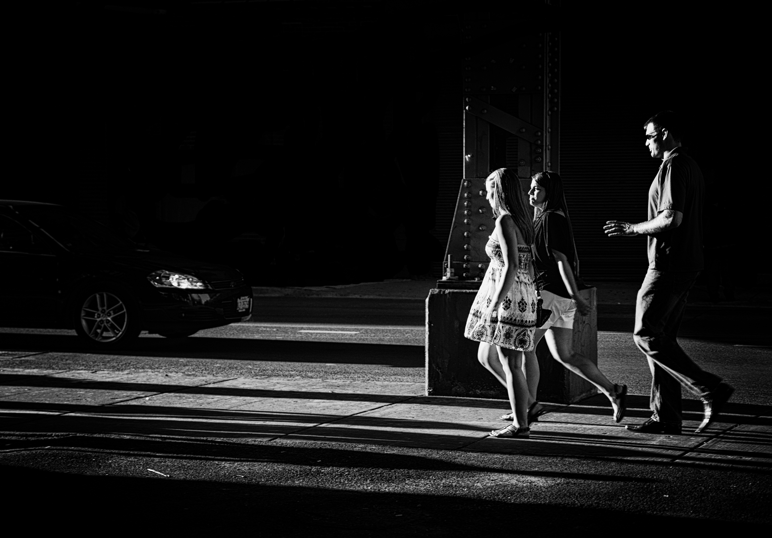
Light can also transform and personify ordinary objects. In this photograph, light is not only acting as negative space. In fact, it brings together two key elements in the story: on one side, the group of people happily walking. On the other side, hidden in the dark, the shadow of a car coming at them. There is a strange and powerful contradiction between those two elements, and the car can easily be perceived as another character of its own – with motives of its own. As a result, the image conveys a threatening feeling, a sense of cinematographic drama that gives a totally new meaning to the image.

Hope you enjoyed this article... and to the next and final chapter of this book very soon!