Hi everybody,
I am pleased to announce a new self-publication of my work in Japan, that you can find for free on Issuu: http://issuu.com/marielaigneau/docs/tle_clash_of_dreams
street photography tips, london street photography, london photography
Hi everybody,
I am pleased to announce a new self-publication of my work in Japan, that you can find for free on Issuu: http://issuu.com/marielaigneau/docs/tle_clash_of_dreams
Cities and people have always been fascinating to most of us. Of course, street photography is about people. But more often than not, the city lies behind to tell a story about these people, as if the city could reflect and emphasize what’s going on inside us, perhaps telling more about our dreams and fears than the longing human silhouette already escaping the frame. While both urban and human elements have their own vital importance in creating interest and uniqueness, I believe that this is at the intersection of both elements that lie the greatest stories being told. To the same extent as light cannot exist without dark, it often seems to me that human and city elements are indivisible – they not only complement each other, they in fact converge to tell a more complex, more powerful story of humanity.
As a first step to understand the city-human relationship, we will discuss the case of minimalist urban landscapes where the city plays a predominant role, minimizing human beings as part of visually simple or complex compositions. As we will see later in this post, the opposition between soft human shapes and harsh urban lines is not only visually pleasing: it can convey strong emotions to your viewers, and can help us understand the complex relationship that connects people to their city.
Giving a sense of scale: the minimalist approach
Minimalist compositions in street photography look at integrating human elements into an existing urban landscape, and can range from overly simplistic to complex visual compositions. The key of minimalism is to create a sense of scale, of proportion between people and the city itself, and then to purposefully minimalize the space taken by the human element compared to the city elements.
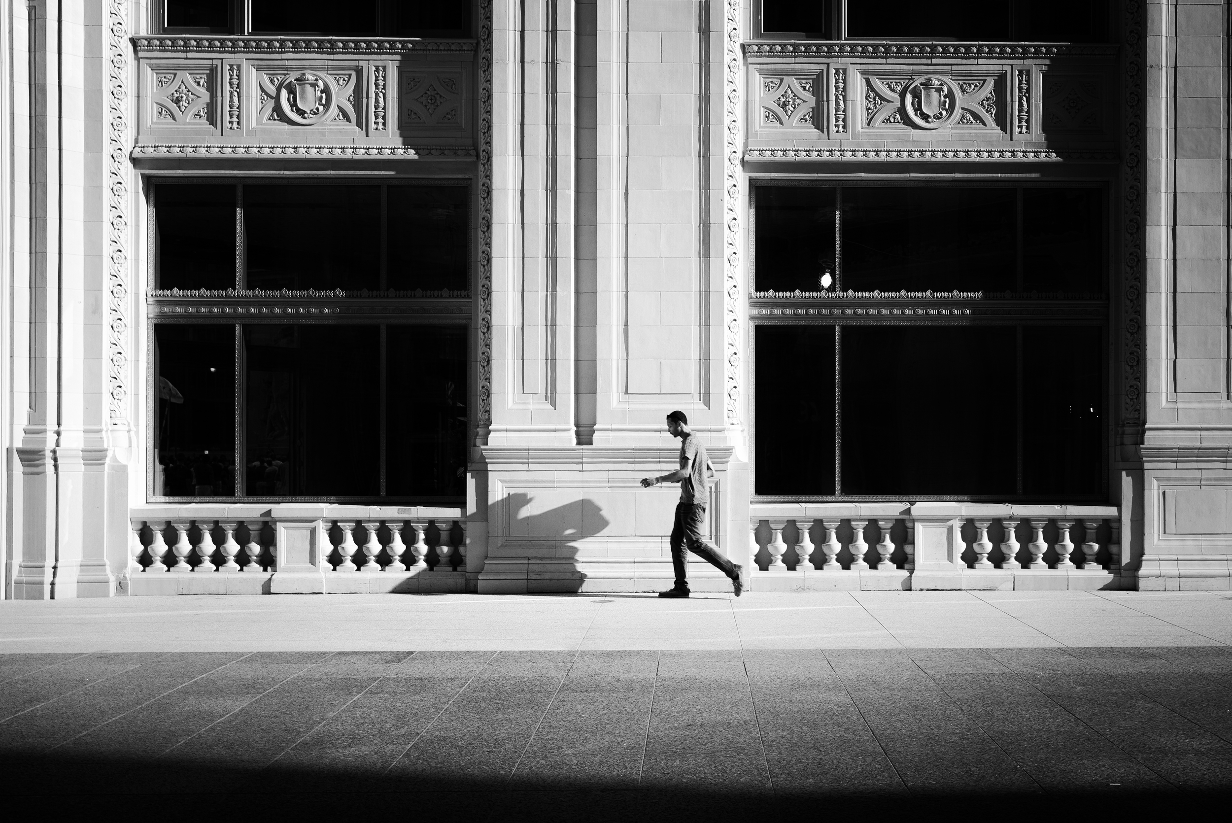
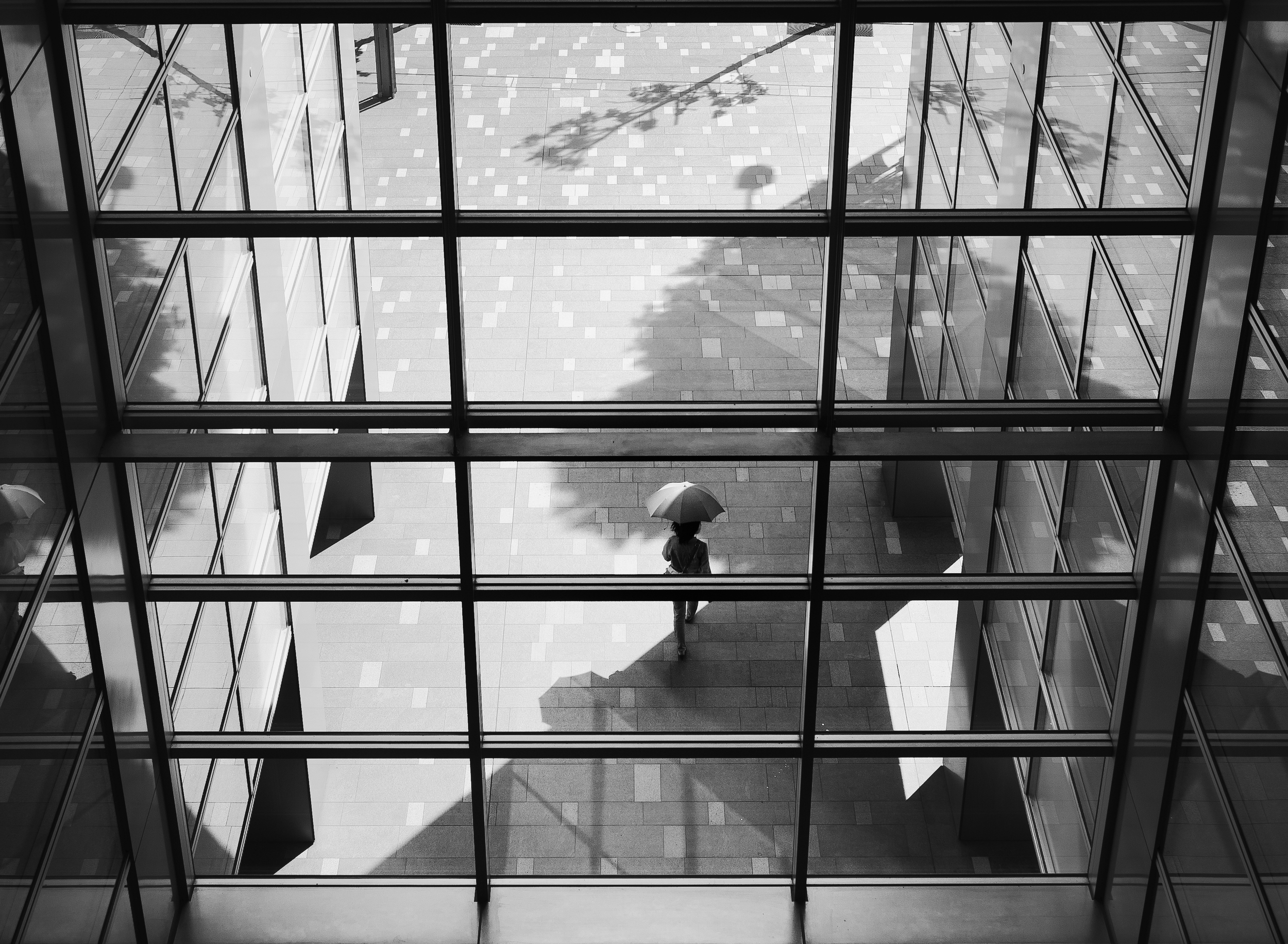
The first image is an example of a simplistic minimalist composition, made of a person walking alongside a huge building. These types of shot will require large focal lengths, to take in as much of the surroundings as possible. The resulting image is as simple as it can get, almost naked – with that man walking by himself and followed by his shadow. This second image shows a more complex visual composition – while easily recognizable, the human element shown as an umbrella is surrounded by many shapes within shapes, some forming patterns, and some breaking existing patterns to add more complexity to the whole image. In both cases however, the human element is definitely reduced to a minimal form, giving birth to the so-called minimalist street photography.

When looking for a suitable background, you can find many candidates throughout the city. Arcades, because of the sheer size of the architecture and the appeal of its symmetrical making, can be a valuable starting point. With arcades, it is easy to integrate human elements at the right time and the right place: either in the continuity of the arcades, like on the image on the right, or on the contrary, placed in an unusual location for a more surprising outcome, like on the image on the left.
But minimalist compositions can play with an infinity of shapes and lines to exist. Look right in front of you, on the other side of the street, for interesting structures that can provide an extension to human beings walking in the city, such as this image of Chicago South loop on the left. Or focus your attention on the facade of a building with transparent stairs – where the human element will be breaking the pattern, all at the same time disrupting the balance and strengthening the superb geometry and details that city backdrops can provide.

Highlighting the human element: of light and composition
There are two ways to emphasize the human element in a minimalist composition: through using light to create distinct contrasts and tones, and through composition and framing. The key to those compositions is to highlight human beings just enough as to take them out of the ordinary chaos of cities and urban settings. Simplicity is important here, as too many prevalent elements may dilute your stories and pose a challenge to your viewers. If they are not able to identify your subject(s) right away, the impact of your picture may be somewhat lost on them.

First, light is everything. Tonal and color differentiation in minimalist compositions is a must, not an option. In this example above, the man stands out because of the subject’s central placement – where the light and color values are stronger, and thus able to instantly attract the eyes. The vertical lines surrounding him also act as a blocker, isolating the space around him from the remaining of the scene, at the spotlight of a theatrical stage. All other city and human elements are faded in comparison, creating more complexity, but at a level that the mind can comprehend and accept.
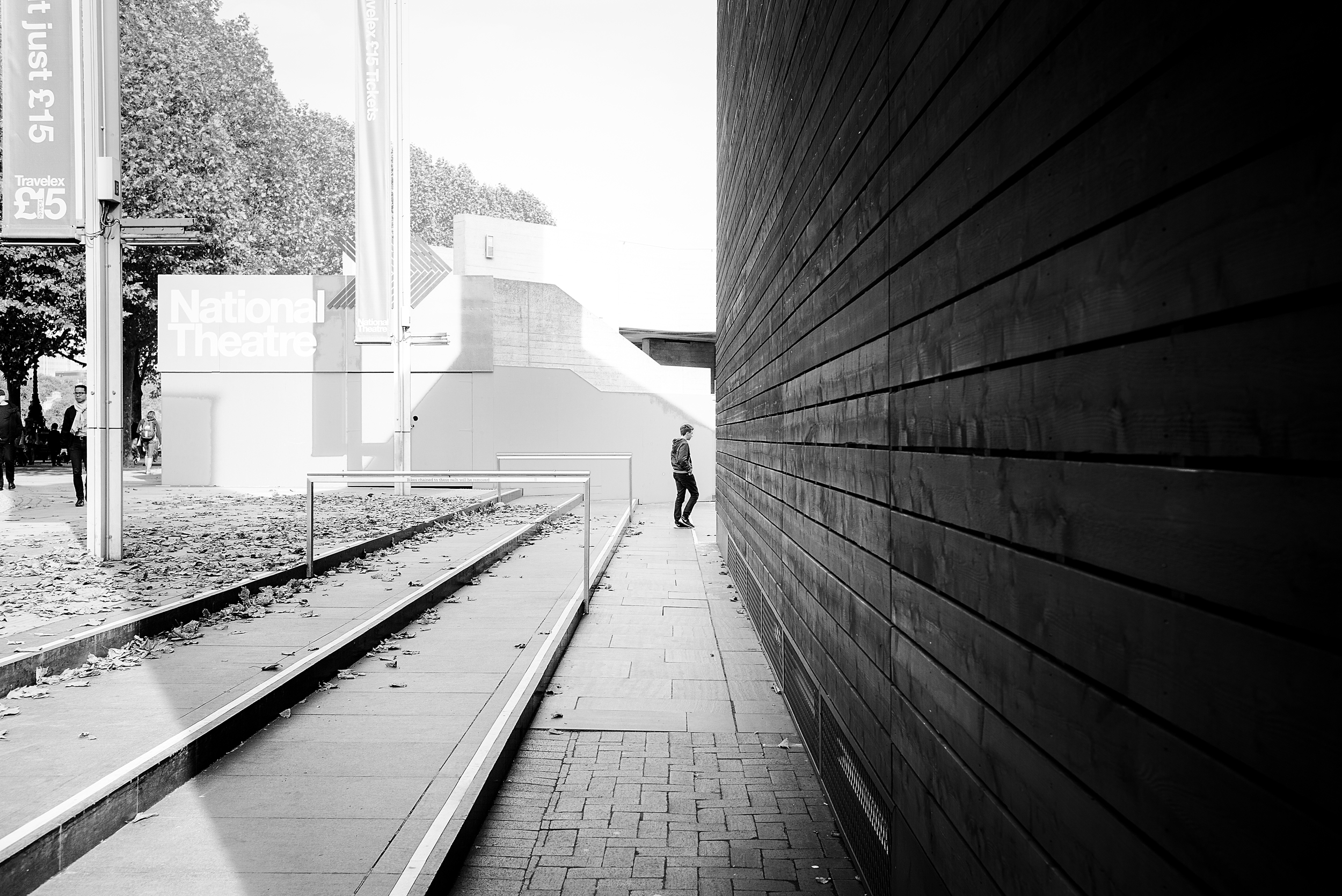
Secondly, leading lines drive the eyes to the subject in a non-hesitant manner. Those compositions are generally more simple and straightforward to the mind, with a clear, well defined path to what the eyes should be seeing. It also creates depth and perspective, thus making the image more interesting overall. Central positioning within the frame also makes it easy to understand the story in the picture. All in all, each composition element in this picture is meant to achieve one simple result: lead us to the main character, at the intersection of several geometrical planes.

Leading lines though can be less obvious and more subtle to the mind, like in the above example. Here, the line is diagonal, starting from the right and slowly taking us to the silhouette of a woman. What also works in this image is the strong tonal contrast between the subject and the immediate background where she stands, making her the ultimate subject of this black and white urban landscape. This image however doesn't stop at the woman, and is an example of how the city can extend well beyond human beings – showing how small we are in the larger city surrounding us.
Understanding flows: creating movement and dynamic
Minimalist compositions lend themselves to interesting visual puzzles, at times static, and at times strangely dynamic. When one understands flows, then it becomes easy to capture your subject in a dynamic setting. First of all, as you probably know by now, the eyes go from left to right, and from bottom to top. This is how the mind works – and everything going against that flow may be disturbing and strangely unbalanced. The first two pictures below are adopting a similar pattern: they all showcase characters on their way from left to right, at various position within the frame. But the dynamic is not created simply by this directional movement: it is the utilization of city elements to strengthen that movement that will be decisive to create dynamism.
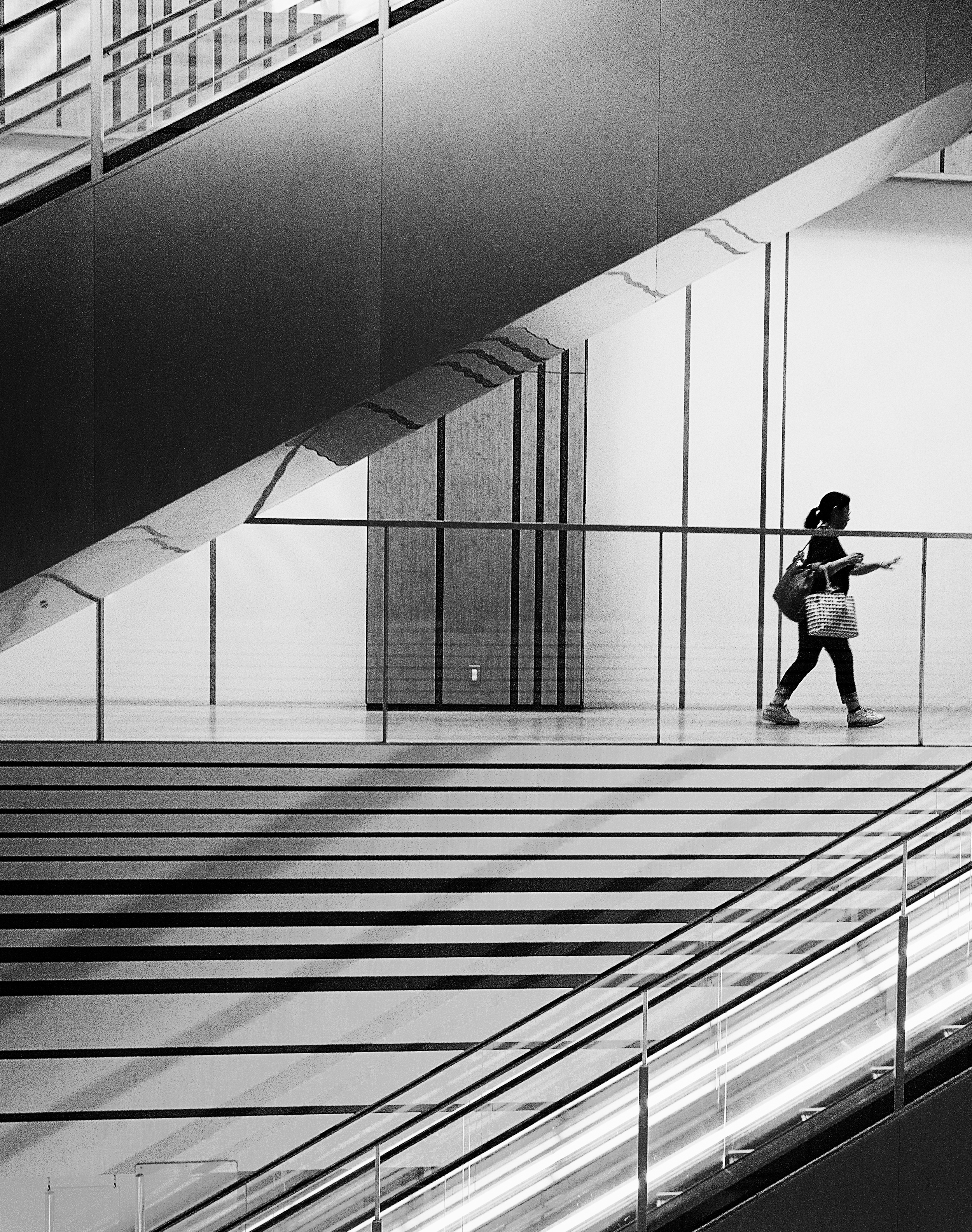
In the first image, the disappearance of the subject from the frame is aggravated by the strong diagonals created by the elevators around her, following a left/bottom – top/right direction. Those diagonals are some of the strongest elements a picture can have to create invisible flows and very real sense of movement. All the lines tend to follow and support the subject’s movement, emphasizing a clearly defined sense of motion and directionality.

While more abstract, this second image follows a similar flow with a main character being absorbed by the black mass of shadows. Again, a strong diagonal cuts the image in two, connecting the man to some outer part of the image situated in the top-right corner. This connection creates movement per and in itself, opening up the image to some unknown destination for the mind. The resulting effect is the anticipation of the man moving into the dark space, preventing the image from feeling otherwise static.
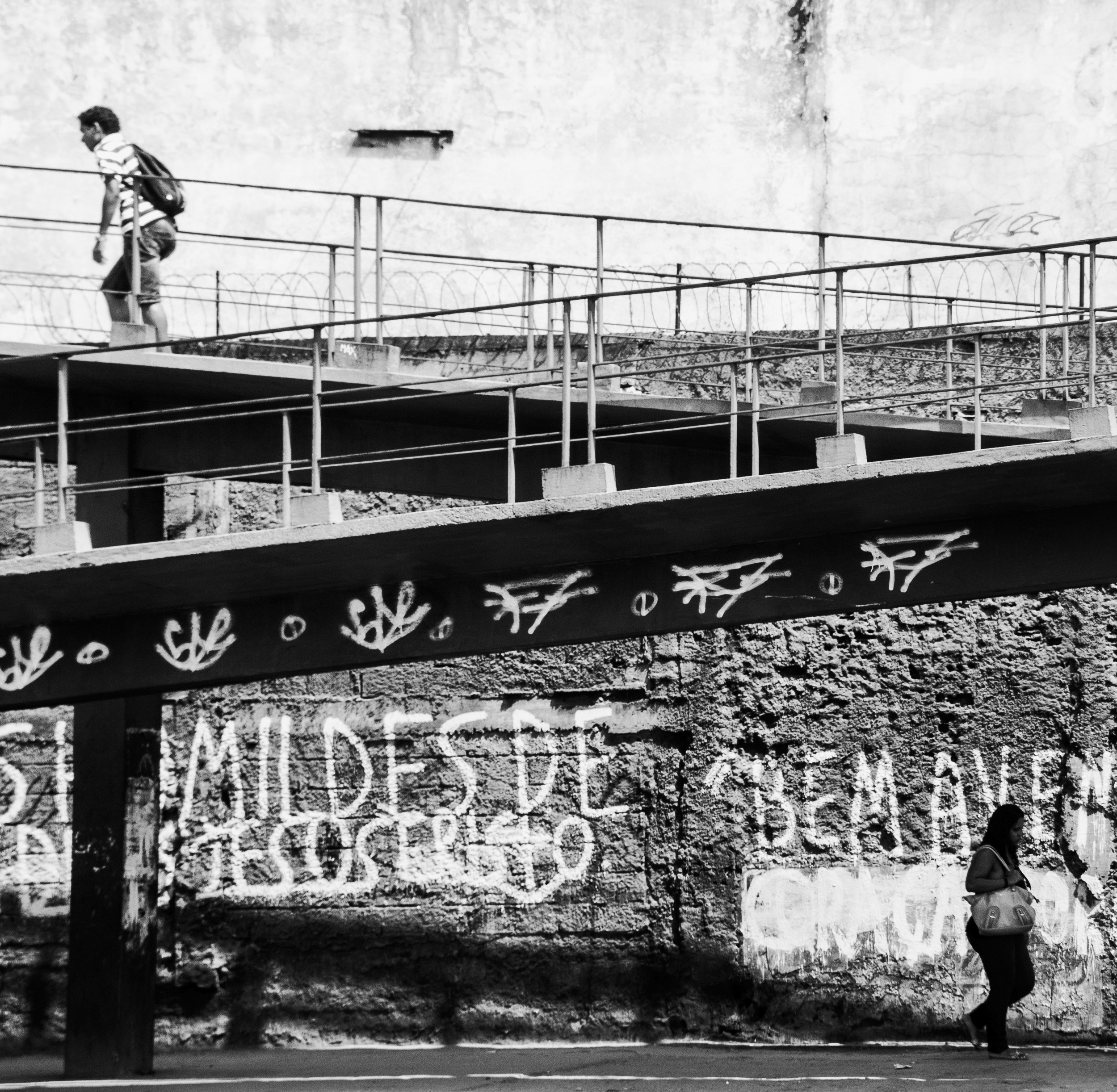
Another technique is to present two subjects going into separate directions, as in the image above. Here, the combination of those opposite directionalities with the bridge that connects and separates all at the same time creates a sense of fragile imbalance, not unlike a scale that one would use to weigh different objects. The image becomes very dynamic, full of opposite forces driving in multiple directions at once – creating complex flows in the image, and resulting in a clear sense of opposite movements.
Towards abstraction: playing with shapes and space
Minimalist compositions can, at times, be highly abstract. While in most images, human shapes are seen as distinct from their urban environment, we can easily take the opposite direction and minimize this distinction to create more abstract and visual compositions. Looking back at the way people perceive images and components of a story, the basic distinction between subject and ground (meaning anything else surrounding the subject) is particularly important in enabling them to understand the story going on. But why would we want to make it easy? At times it can be fun to create visual abstractions where the human element cannot be easily understood, seen, and spotted. This often results in more complex and surprising images, requiring more efforts from the mind to decipher the visual puzzle created.

As an example of abstract urban landscape, here’s a shot that I took from my window back in the time I was leaving in Chicago. As you can see, the angle and elements make this shot highly abstract. It is hard at first glance to recognize the setting: a sidewalk, a tree, a car, and a man walking in the snow. The dark human shape seems to belong to the mix of abstract elements making up this shot.

This shot of the Vatican stairs take the abstraction a step forward, through blurring the lines between human and architectural shapes. If you’ve followed my different posts and book writings, you will easily recognize this example. If not, here’s what there is to see: the human heads and sculpture heads are hard to differentiate, making it a puzzle for those looking at this image. What’s alive and real vs. what’s in stone and from the past cannot easily be distinguished, creating a sense of abstraction.

This last shot shows an example of using negative space and light in order to create a perfectly abstract composition. The role of human elements in this picture is less and less clear, as those elements seem to merge with their surroundings. The delimitation of buildings is non-existent, merging into space of bright light and dark shadows alternatively. The resulting image is made of dark and light elements reconstructing a scene that doesn’t exist, with buildings that are not what they seem to be, and a place that we can’t easily recognize.
Emphasizing emotions: unveiling the human-city relationship
The most interesting use of city elements is to emphasize emotions in our stories. Although harder to create, and with no clear rules to follow, here’s an attempt at identifying the various emotions that can be emphasized through minimalist compositions – when the gigantic city overwhelms human beings and reflects part of their deeper feelings.
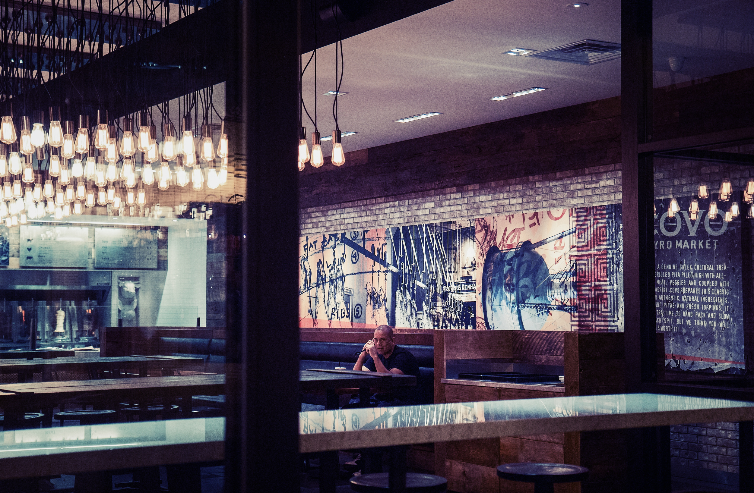
Urban loneliness is one of the most common emotions that minimalist street photography can convey. In general, lonely figures lost in the chaotic urban landscape generate this type of emotions. This is the case for example of the image above, where a lonely man sits in the middle of an empty restaurant at night, leaving us wondering where all other patrons may have gone.

Sometimes, rather than loneliness in itself, this is the feeling that the whole weight of the world falls on our shoulders, like in this image of an old woman having climbed a hard and steeped road despite her advanced age. The connection between the city and this character is made stronger by the form of her back, rolled over, and the patterns of high blue doors seemingly of another age and time.

But our relationship to the city can also be mystic in essence. In this image, the human drama happening between the two lovers is emphasized by the voluptuous city playing in the background, as if they were on the edge of the world – hidden from the city, and yet an integral part of it.

When subjects become active observers of the city, other emotions can come to life: such as awe in front of sheer beauty, of the complex and timeless work of man displayed in front of their eyes. In this image of Chicago architecture, the couple under the umbrella appears mesmerized by the view laying down in front of them. They’re in communion with their surroundings – feeling part of the city, and inspired by its timeless history and strength.
I am so proud of being part of Black and White Street :) This group aimed at supporting street photographers from all over the world has changed my vision of street photography. And has brought closer some amazing friends along the way. It's been almost a year now that we have published our first ever edition of the best photographs from the group, in a collection that you can find on Blurb.com: http://www.blurb.com/b/5196251-black-and-white-street-group
Don't forget to go to www.blackandwhitestreet.com and streetsincolor.com, for more awesome street photography!