blog posts

street photography tips, london street photography, london photography

Objectivity vs. subjectivity: the science of camera angles

Cinema, as an art, has long been paying attention to camera angles. And indeed, the choice of camera angle will have a deep impact on how the viewer will eventually experience the scene and the story. Will they observe at a distance or will they feel part of the action? Will they identify themselves with the subject or will they react to this confrontation?


There are I believe four major types of effects generated by camera angles:

  1. Omniscience: When the camera angle allows for a very objective and neutral point of view, the viewer can distance himself from the scene and become an impartial observer able to “see it all”. Generally speaking, most medium to long-range shots will provide that effect.

  2. Awareness: Some shots establish a direct connection between viewer and subject – the viewer is aware of the subject as a person, with qualities and personality of their own, which can sometimes lead to a psychological confrontation.

  3. Experience: When the line between objectivity and subjectivity is blurred, viewers can sometime experience an astonishing contradiction: they feel as if they are “here” within the scene, yet unnoticed by the subjects – they experience the scene as an invisible observer, in a very voyeuristic manner.

  4. Identification: Finally, certain shots – especially close ups – will yield to a process of identification. The viewer projects its own feelings and emotions on the subject, creating a very personal story based on their own personality and state of mind.

The first two effects: omniscience and awareness are objective point of views, meaning that there is a clear separation between the viewer and the subject, each standing in their own sphere of existence. The last two effects: Experience and Identification are subjective point of views, where the viewer is forced into the scene, eventually associating himself with the story.


John Suler, in his book Image and Psyche, provides an outstanding description of various camera angles and their psychological impact – so I will not describe each type of camera angles at length as you can read more by yourself. Instead, I will focus my analysis on these four major effects, and will provide a few practical examples of camera angles that can be used to create those effects.

There are several types of camera angles to consider moving forward, as explained by John Suler:

  • Vertical orientation: eye-level, low-level, high-level

  • Horizontal orientation: front, side, rear, slight deviation on the left or right (POV shots)

  • Straight vs. tilted orientation

  • Field of view: long-range, medium range, close range


Effect 1: Omniscience

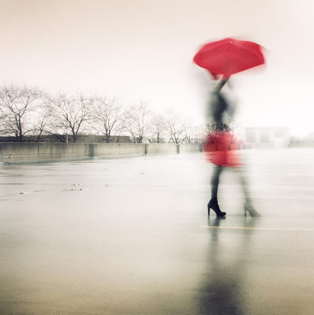
Behind the idea of omniscience lies the principle of showing the big picture. The viewer is given the opportunity to see the scene in its entirety. Long-range and medium-range shots are best fitted to create that effect. Shots that are at eye level (not higher, not lower) will provide the most objective point of view, while lower / higher shots will create interesting subtleties in the way viewers perceive the overall scene. The key to omniscience is to integrate all meaningful elements into one shot: the subject of course, but also all the surrounding context that will extend the story from that of a man alone, to a man within its environment.  In the above image, viewers are shown the entire winter scene, emphasizing the loneliness of the subject. Without the context of the bridge and fog, that feeling of loneliness would be less strong. It is by distancing oneself from the details that we can see the big picture. The lonely figure exists because of the lonely city – both elements resonate and respond to one another to create a more cohesive story.

Straight vs. tilted orientation

Tilted angles – long to medium shots – will largely influence how viewers understand the context around a shot. They can still perceive the overall big picture story, but their perceptions and understandings are altered by the different orientation of the image. Tilted images have this impact on people: they feel disoriented, and as such the context may appear gloomier than it really is. In the above image, a typical Chicago alley will appear scary to viewers. Due to the large angle of view, they can still understand the big picture: a man walking away in a deserted alley. However, the tilt contributes to creating a strange atmosphere, as if something was about to happen to that man. We are close here to the “experience” effect which would have been achieved if the man had been closer to us. As it is, the shot leaves a vague feeling of uneasiness to the viewer, with no clear understanding of why.


Effect 2: Awareness

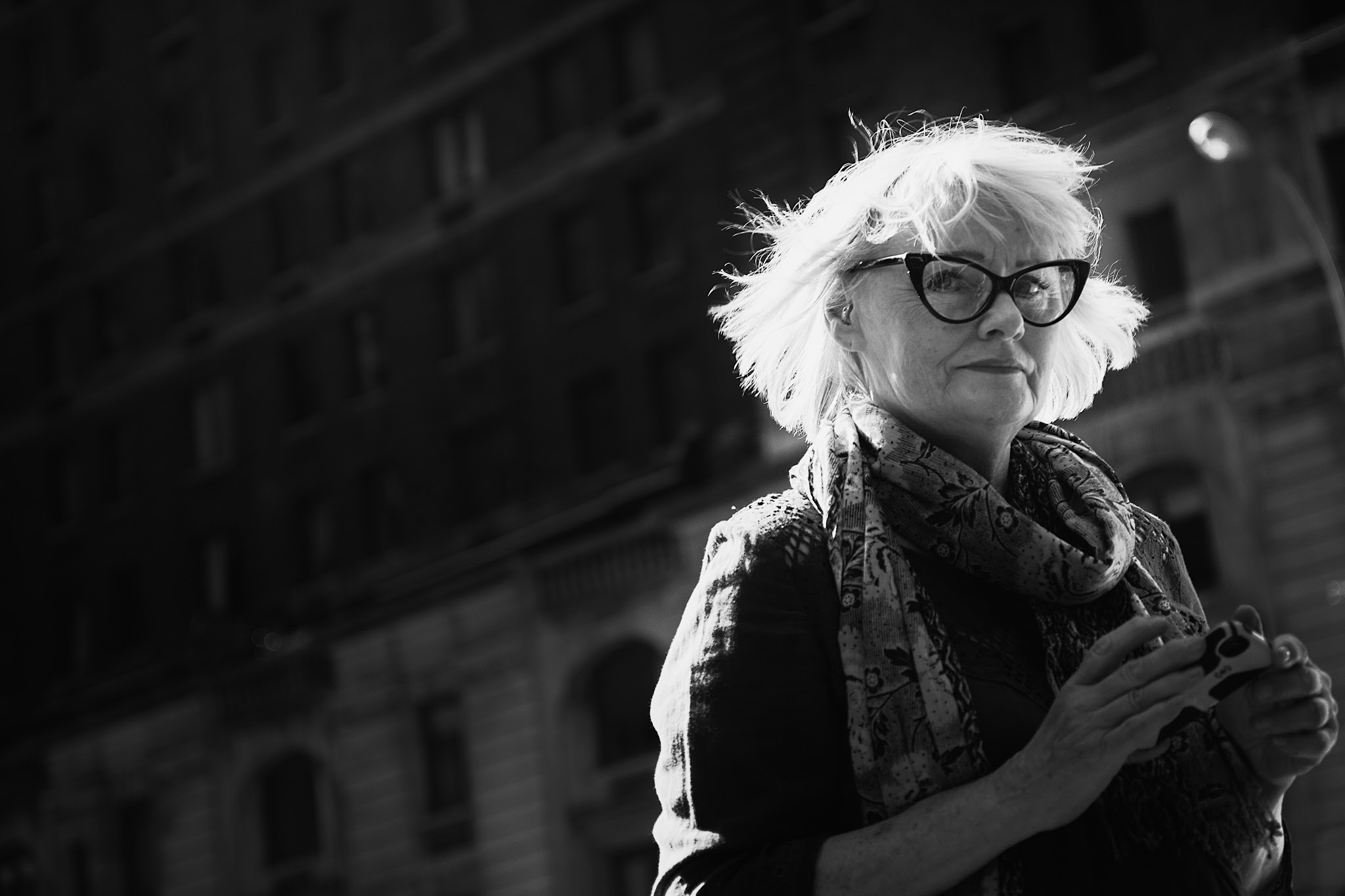
When I started studying camera angles, I found it difficult to really pin point that awareness effect. I realized that many angles could generate this result, with a lots of interesting variations. However, one element was key to amplify this effect: eye contact. Looking into the eye of someone establishes an instance connection between two people – and this is exactly the same with an image. When someone is looking directly at you, you can sense this person’s independent existence. Once that initial relationship is established, viewers will attribute characteristics to this person based on this person’s expression and attitude – and obviously based on their personal life experiences.

This is where camera angles comes into play: shots creating awareness can be of various focal lengths, as long as the eyes appear to be directed at the camera, and as long as the subject has enough presence to draw most attention. The closer you get from the subject, the stronger the feeling of awareness of this other person will be. Additionally, you can manipulate feelings for that person through changing the vertical orientation of your camera.

At eye-level, you will get a straightforward relationship where viewers and subjects are on the same plane. When taking this type of shots, you establish a simple, direct connection between two human beings. This is a one-on-one relationship, where the viewer is presented with another human being that generates curiosity and interest. The eye connection is very strong and establishes an invisible line that is almost impossible to ignore – as if that person in the image was seeing you as well, was aware of you, just as you are aware of them.


Above eye-level angles will make the subject appears smaller and weaker – as if de-emphasized by the camera. Below eye-level, as it is the case in the picture above, subjects will appear bigger than life, stronger, more imposing – their importance will be emphasized. The characteristics that viewers will attribute to the subjects will depend heavily on the angle you choose – so be aware that camera angles will strongly influence the story being told, no matter what.


Effect 3: Experience

In cinema, many scenes are meant to make the viewer feel at the center of the action. As the camera follows the actors, we are often given the impression that we are moving along with the camera… following their every step. When two characters discuss together, we feel in the middle of their conversation – yet the characters never actually look directly at the camera. While this can lead all the way to identification, most of these tactics will, at least, enable viewers to experience a scene from the inside, not from the outside. And this is where the magic happens in cinema: from being a mere observer, we become an invisible actor: we are forced into the story whether we like or not.

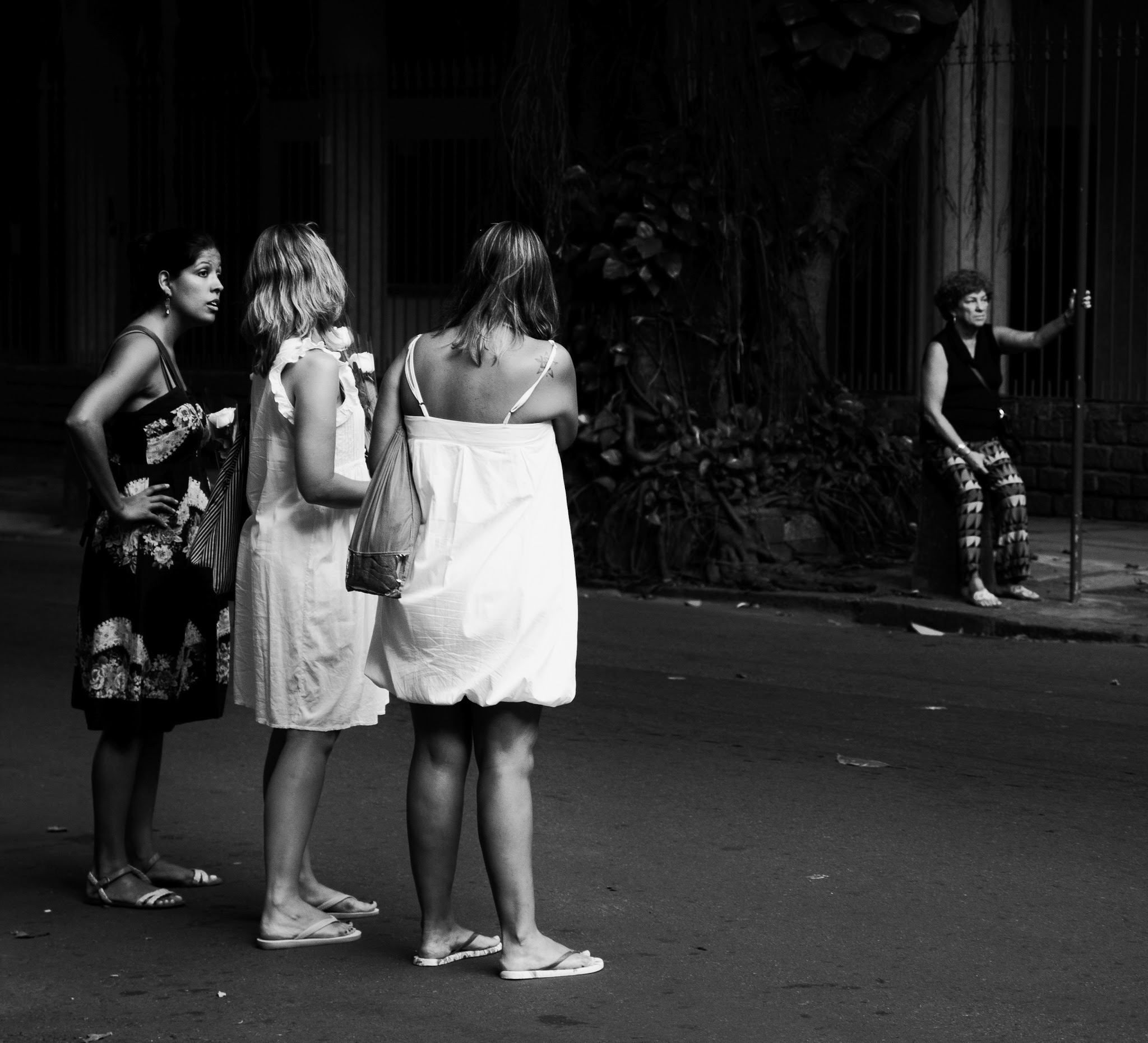
 Photographers have a lot to learn from film directors in that matter. But fortunately, we have all the tools at our disposal to make it work. In the above shot, the viewer starts to experience the scene more subjectively. While still being an observer, the viewer is close enough from the main subjects to share their complicity – the side / rear position of the camera is very useful under such circumstances. The subjects do not see us, but we see them, and there’s a clear feeling that we could be discovered at any time, should they decide to look in our direction…

 When getting closer to people, we can best create the experience effect by ensuring that the subject is not looking at the camera. For this to happen, choose a side angle or a POV angle (like in above shot). The closer you get from people, the more “voyeuristic” the experience will be, and the more strongly your viewers will experience the scene from the inside – as if they were there, invisible actors of a story that they do not control.

A wide low angle can provide marvelous results as well when it comes to experiencing a scene. Not only does the viewer feels at the center of the action, but the wide angle provides much opportunity to experience this action differently – with some added roughness, as well as more theatrical context – a tactic used by many well-known street photographers in fact.


Effect 4: Identification


This last effect is without a doubt the harder to achieve – and this stems from the unpredictability of your viewers’ reactions. While everyone projects feelings and desires into images, identification itself can only happen under specific psychological conditions.

Let’s first discuss what I mean by identification. Identification can come from identifying oneself with the subject or the story – this is the simplest aspect of this effect. In the picture above, for example, I see myself in this little girl – I understand and relate to her attitude and expression, and she reminds me of myself… in ways that I will not elaborate upon here!

However, there is another factor determining possible identification with a subject or a story. Contrary to what you may think, people identify with a picture when they see something of themselves in the picture, but not necessarily themselves. For example, in the image below, you can identify with the scene because it reminds you of your daughter or grand-daughter. This image resonates with you because of this association – not because you are being reminded of yourself.

How can we achieve or at least facilitate the identification process? From my experience, and my experience only, medium range and close ups are more indicated in achieving that result. More objective angle (e.g., at eye-level) will also probably work better as they will establish a straightforward connection between subject and viewer.

Other than that, there are no clear rules or patterns suggesting one way or another. In fact, identification can occur despite your best efforts: it can be someone looking straight at you that touch something deep in your soul. It can be the lovely neckline of a beautiful woman in a close up shot. It can be the lonely expression of a young person walking alongside a building. It can come from your deepest fear, or your most secret desire. It can take many forms and shapes – and there’s no way to predict when it will occur.

Truth being told, not everything can and should be explained by rules. In photography as well, there is a place for miracles.


Why Street photography shouldn’t be defined by anyone but yourself

In any group, in any setting, you will find yourself wondering: is my photograph a street photograph according to the standards of that group? Am I close enough from my subjects? Does it look candid enough? Do I successfully portray “life within our time”? Because each group or community is founded on a set of rules, those questions may be useful indeed. But one should be reminded that belonging to a group is not an end in itself. It is a way to find who you are as a photographer, within that group of course but as importantly, beyond it.

Street Photography groups are very often made of like-minded people, sharing a common understanding of a genre, established conventions, do’s and don’ts.  It is in essence a platform to challenge oneself within a set of constraints established by the group itself.  The downside of any such group is the potential for stifling innovation and creativity. Loyal members usually live and breathe by the group’s vision for street photography, forgetting to question the validity of its premises. On the other end of the spectrum, you’ll also find outliers – those new members joining with a defined idea of how street photography fits with their personal vision – who find themselves outcast for producing work that doesn’t align with the group’s established guidelines.

I do think that groups are useful – but they shouldn’t keep you from experimenting and finding your own definition of street photography, whether it fits or not established conventions. Because innovation comes from pushing frontiers, it is of the utmost importance that each of us questions this definition before embracing it. The more diverse those definitions are, the better we’ll be able to evolve and elevate this particular genre. And most importantly, the more equipped you’ll be to find your own path – that path that will eventually lead you to produce unique and remarkable work on your own.

My work is often described as street photography. Yet, after going through this process myself, I realized that my own definition for street photography was in fact much broader than established conventions.

First, street photography for me is meant to question, not to assert. It is meant to question who we are as human beings, through the exploration of our interactions with the world, and with others. Secondly, street photography is not only about the world – it is also about us. In that sense, it should lead to a better understanding of the complex dynamics at play not only between us, but also within each of us.

At the end of the day, defining street photography has been about defining who I am as a photographer: not only what appeals to me within this genre, but also defining the higher purposes that fundamentally drive my work as a photographer, within and beyond established "boundaries".

As an example, I will provide below a few photographs often considered outside the genre of street photography. These images are remarkable in their ability to push the boundaries of a so narrowly defined genre. But more importantly than that, each of these images has had a deeper impact on me than most of the more “conventional” street photographs. They truly resonate with me through the mystic power of their carefully drafted imagery. They tell compelling stories of humanity – which to me should be the most important purpose of street photography.

As you will see, the photographs below have broken some preconceived notions about what street photography is and isn’t – and have gone willingly beyond established conventions:

  1. Street photography should be realistic, not abstract
  2. Street photography should be urban by definition
  3. Street photography should be candid, never staged
  4. Street photography should have humans for subject

I admire their authors for not being afraid of being who they are – beyond what’s expected, beyond established boundaries. I admire them for taking the risk of being misunderstood, uncategorized. I admire them for standing up for themselves and for their vision, no matter what the “crowds” may say.  To me, those photographers are true artists, in the original sense. They portray a world in accordance with their values and their vision – and in doing so, they leave us feeling different about the world and about ourselves.

So stop following and start thinking. What does street photography mean to you? And what role does it have in achieving your unique vision?

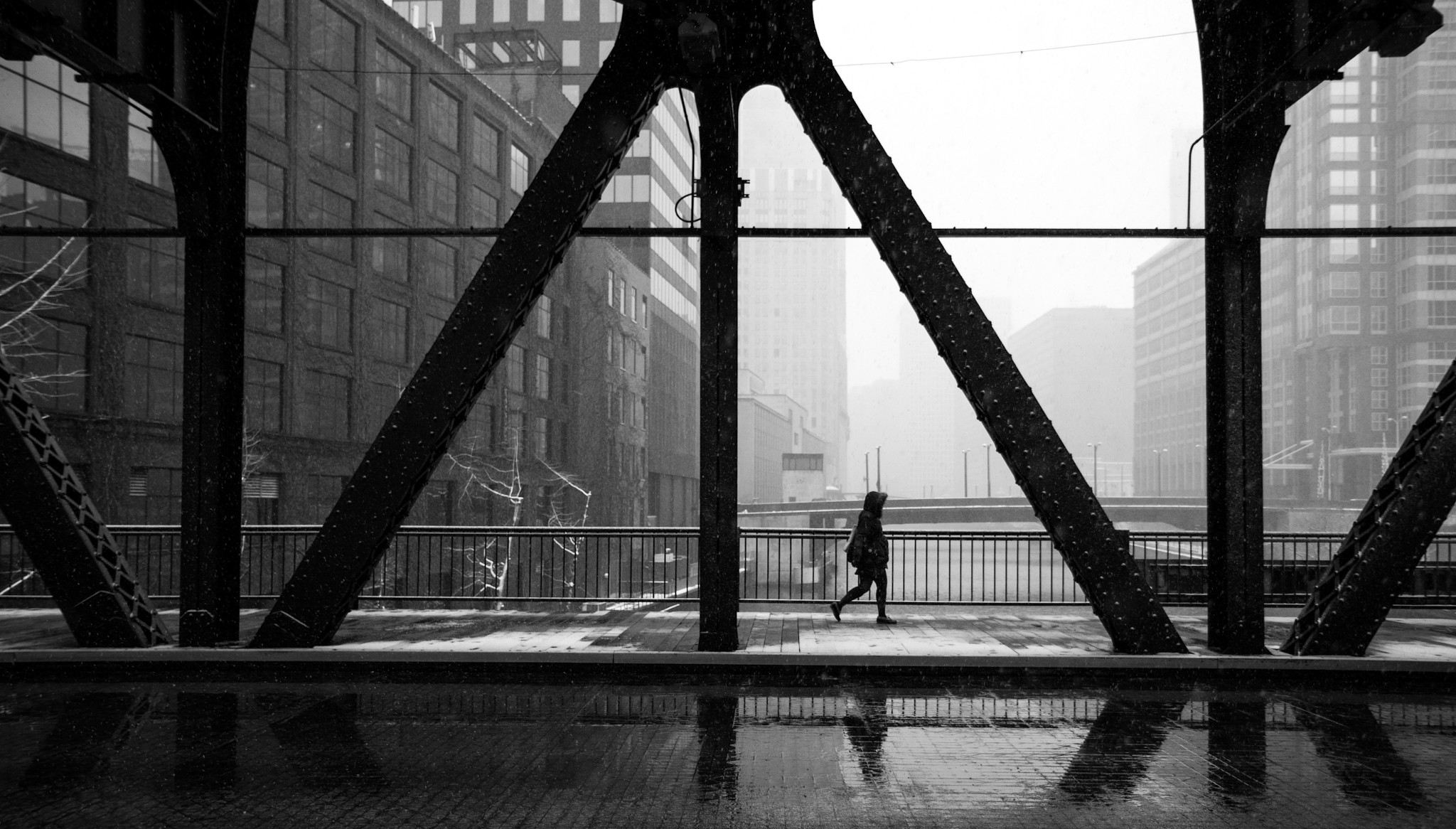
Photo by Tatiana Avdjiev

Photo by Yuzuke Sakai

Photo by Mirela Momanu

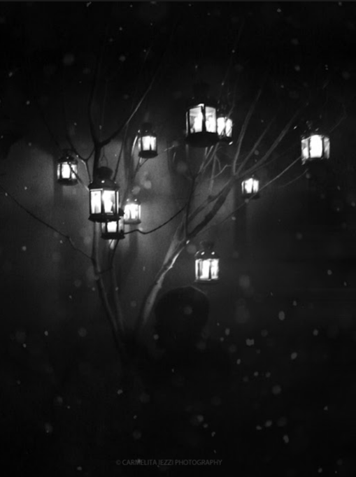
Photo by Carmelita Iezzi

Photo by Emilian Chirila

Photo by Rachel Chicheri 

Photo by Rommel Bundalian

Tension vs. harmony: the consequences of breaking the rules

Most of the rules of composition are there to create harmony – to ease viewers into the photograph with grace and mastery.  As I said before, rules are useful, and knowing them is fundamental to creating impactful pictures and stories. So what if you don’t follow the rules? There are in fact only two possible outcomes to ignoring the rules of composition:

1.       The first possible outcome is failure. You’ve broken the rules, but didn’t know you did – because you don’t really know the rules anyway. You picture is unbalanced, lacks cohesion and substance.  The idea has potential, but the execution leaves viewers fairly unimpressed.

2.       The second possible outcome is creativity. You’ve broken the rules, but in doing so willingly, you also created what I call tension in your image. Instead of being easy on the mind, your picture raises questions that will captivate and generate interest.

You’ve heard me well. The consequence of breaking the rules, if done properly, thoughtfully and creatively, is to create tension.  I will explain what I mean by that. Tension exists when the mind cannot see what it expects to see to fully understand the story. The idea of “tension” is anchored into the Gestalt theory – a theory explaining how the mind perceives and interprets relationships between elements in a spatial configuration.

So what happens when you deprive the mind from seeing what’s expected? You force the mind to imagine the untold, the unseen. You request viewers to go beyond the frame in order to get closure. You leave open too many questions that viewers will desperately seek to answer.  In short, you create tension - and that, by itself, is a terrific fate, but one that is hard to achieve.

In practice, how do we create tension? What does it look like?

Just as there are many rules of composition, there are many ways to break them – but there are only a finite number of ways to create tension. I will illustrate this concept through three distinct examples, which is by no means an exhaustive list J


1. Blurring the lines between subject and environment

Traditionally, good composition is meant to direct the eye to the subject. Everything we do is aimed at separating the subject from the foreground AND background in clear, indisputable terms. The idea for applying this rule is to give preeminence to the subject as opposed to the rest of the scene. The subject becomes the point of clear focus, and again, the “owner” of the story being told.

The Stairs

Let’s think about what it means to break that rule: what if my subject cannot be easily distinguished from the environment in the photograph? Then discomfort comes in as the mind cannot properly process what’s going on. It may be that the environment takes precedence, making humans feel small and vulnerable – relegated to a secondary place in the frame. It may be that the original distinction between subject and environment doesn’t really exist – one and the other are interchangeable, part of a bigger scheme. Interpretations can be endless, but one fact remains: it will demand more effort to understand your picture. And in many instances, more effort equals deeper interest.

In The Stairs, the man is quite visible at the bottom of the picture. But as the eyes travel up to the top of the stairs, the difference between ornamental objects and human figures become increasingly blurred. Are these men looking down at us or are these vestiges of the past?


 2. Leaving the story untold and depriving the mind from closure

Blue Dream

The human mind needs closure. There is a need for a beginning and an end to everything. In fact, the human mind cannot easily tolerate gaps, nor can it be sustained with allusive answers. This is why playing on that weakness can be surprisingly successful in photography and art in general. Again, the key is to understand that requesting incremental effort from a viewer will pay off in increased interest for the picture.

In Blue Dream, the woman is facing the frame of the picture, where the eye cannot go. The relationship between the two silhouettes remains allusive: they seem to be at proximity, yet no connection is made between them.  The circumstances and context is totally unknown, leaving much gaps to be filled.


Night Beauty

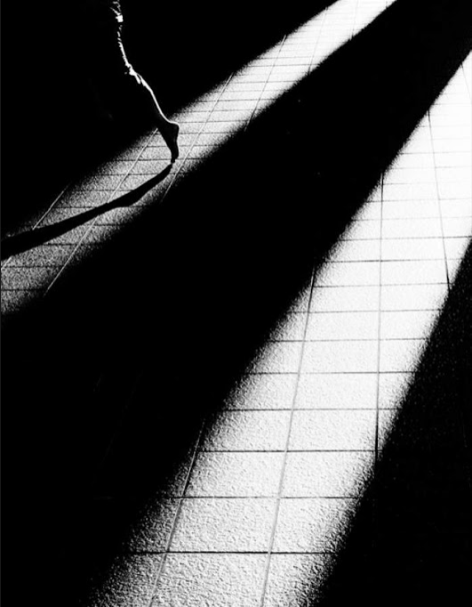
In Night Beauty, this is the relationship between the young lady and the overwhelming darkness that is most interesting. Combined with her forlorn expression, the viewer is left guessing why she seems to carelessly avoid the shadows, and what lies beyond her pensive eyes.

The two pictures below have something in common: they only tell half of the story, leaving open many questions – thus creating a persistent sense of mystery. Not only does the story remain open to interpretation, but viewers are never fully able to grasp the implications of what they’re seeing – thus engendering this so-called tension that we are looking to achieve.


The importance of light in photography

I didn’t realize how important light was to my vision of photography until recently – when it became apparent that I was deeply attracted by photographs using light in a powerful, meaningful way. Of course, one could argue that photography is light, and in essence it would be true. Exposure is about capturing a certain amount of light through one’s lens – and light is at the core of the making of photographs.

Beyond that technical truth, however, mastering light in one’s photography is far from being an easy task. In fact, I would argue that many photographers do not use light to their advantage, especially in street photography. But let’s start with the beginning: how does one “see” light?

Light is such a troubling concept. It can be as obvious as a source of light, whether natural (the sun), or artificial (flash), and as ephemeral as the slight contrasts in tones between a darker façade and a lighter subject. Light can be best understood in opposition to dark – with anything in between being shades of dark and shades of light. Seeing light is thus being able to see those contrasts as if you were taking pictures in black and white, not in color. When looking at a scene, ask yourself: are the contrasts of light interesting enough? Do they support my story, highlight my subject?

The human mind sees and perceives in many ways, but it is useful to understand the role of light in this regard.  Light has three major impacts on how people will perceive the components of your images, and thus of your stories:

·         The human mind is first attracted to the point of highest contrast in a photo or a painting – by that I mean, where the difference between light and dark tones is highest. Thus your subject should ideally be placed where the highest contrast occurs.

·         Light objects convey more weight than their darker counterparts. It means that smaller light objects will easily attract the eyes – and if they’re not your subject, you should be careful to not allow them to distract viewers from your story.

·         Finally, light has an impact on the overall mood. Light spaces conveys lighter mood, dark spaces will bring up feelings such as isolation, loneliness, sadness more easily. Have you ever noticed how dark negative space and light negative space can make you feel differently? Well, this is it.

Let’s test this newly acquired knowledge on the picture below. Light here plays a significant role in defining the subject of the photo: the point of highest contrast is clearly put on the subject, makes it a clear point of focus for viewers. Another point of interest is the overall mood here: the huge negative space created by the wall is lighter in tones than the subject. The overall effect is rather positive: I wanted to convey a feeling of determination, not of isolation and loneliness.

Learning to capture light in a meaningful way is tough, and by no means an easy fate. But once you understand the impact of the smallest variations in your photo, you become more apt to control and use light to your advantage. 

Determination