Tension exists when the mind cannot see what it expects to see to fully understand the story. The idea of “tension” is anchored into the Gestalt theory – a theory explaining how the mind perceives and interprets relationships between elements in a spatial configuration.
So what happens when you deprive the mind from seeing what’s expected? You force the mind to imagine the untold, the unseen. You request viewers to go beyond the frame in order to get closure. You leave open too many questions that viewers will desperately seek to answer. In short, you create tension - and that, by itself, is a terrific fate, but one that is hard to achieve. The more tension you will add in your pictures, the greater the effort required from the mind: and the more interest will be generated as a result.
Why is that so important in street photography? Because harmony is what we see. Harmony is the ordinary, the mundane, the boring. Tension on the other hand is your storytelling ingredient: it opens the door to the imagination, the possible, the dream. It defies the predictable and the expected. It is your key to the extraordinary.
1. Altered visual flow
The usual visual flow of an image goes from the left (top or bottom), and extends to the other side of the image, to the right edge of the frame. Harmonious compositions make every effort to follow this natural flow, allowing our minds to travel through the picture with as few obstacles as possible. Subjects will traditionally be entering the frame, “owning” the story ahead, and offering the eyes a path to explore the remainder of the image. However, that level of simplicity is rarely satisfying in street photography, as by far, too expected, too ordinary. On the contrary, the most dynamic compositions will break this flow – resulting in increased effort for the viewer to comprehend individual elements, as well as connection between those elements.
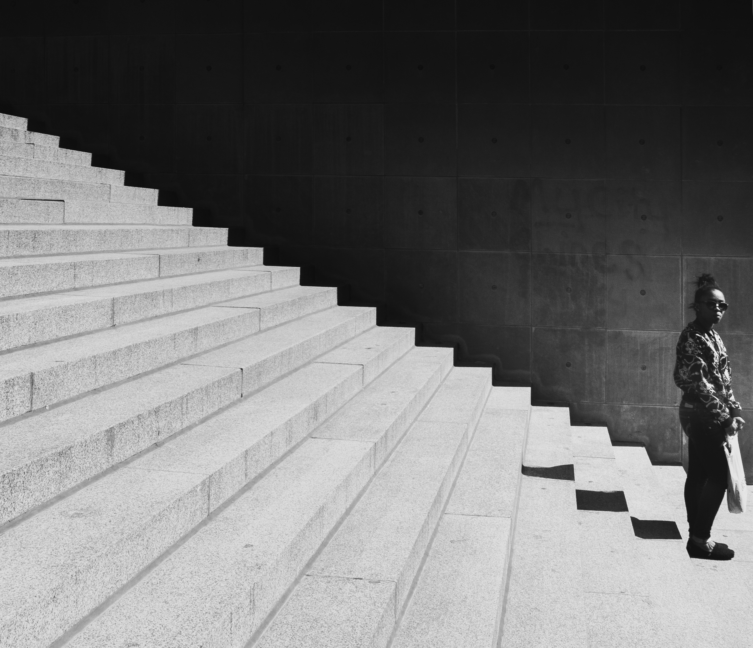
Placing the subject on the edge or exiting
The placement of the subject in this photograph is quite unusual – nearly at the edge of the stairs, and of the frame, the woman appears to stand in a fragile equilibrium. The stairs in comparison stands out by their high graphical impact that the soft lines of the woman hardly break. The result is a feeling of tension – as our eyes repeatedly move up and down, left and right, in search for the lost harmony.
Using invisible lines
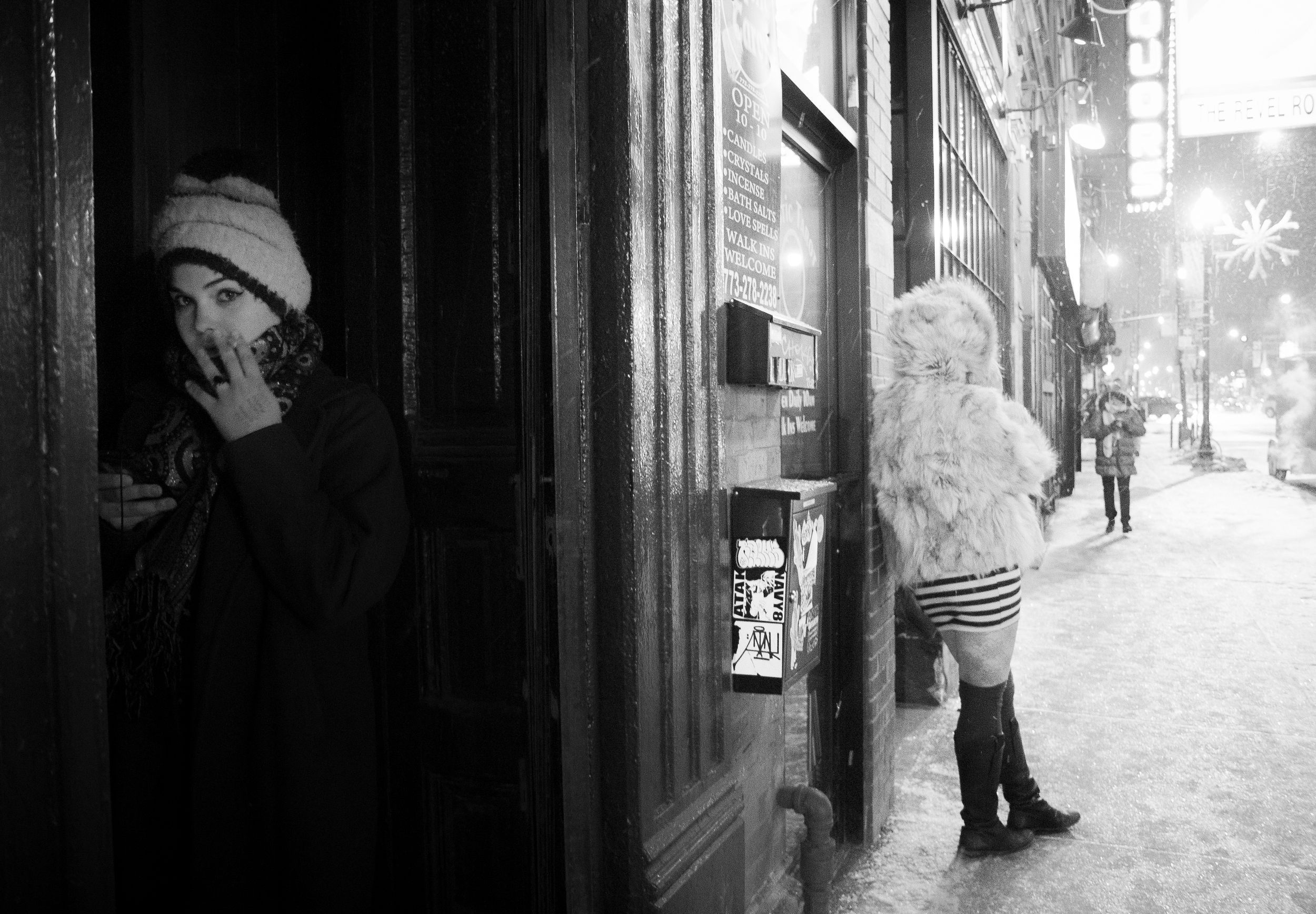
Invisible lines created by human stares are very powerful – more so than static elements. Invisible lines make this image complex at several levels. First, the power of the subjects’ stares is strong because unobstructed. The woman clearly looks on the left, to something located beyond the frame. This not only adds tension to the image, but also contradicts the natural visual flow. Secondly, the boy is starring in our direction, whether at us directly or at the woman. This creates a triangular configuration which is very dynamic, and largely contributes to the overall effect of tension here.
2. Dynamic subjectivity
Angles and points of view, as I have mentioned previously in this book, can make a scene appear very subjective to the viewer – drawing him or her into the action, right at the forefront of the scene. Tilted orientations, close ups, low or high-level angles, as well as direct eye contact can all contribute to powerful subjectivity, creating deliberate tension. This can have a strangely disturbing effect on the viewer, who, from invisible observer, is suddenly propelled in the story as an active player. Dynamic images often use those artifacts, supplementing composition within the frame with unusual, deeply subjective viewpoints. The result is altered perception of the reality, a sense of belonging to the scene, and personal association with the story taking place.
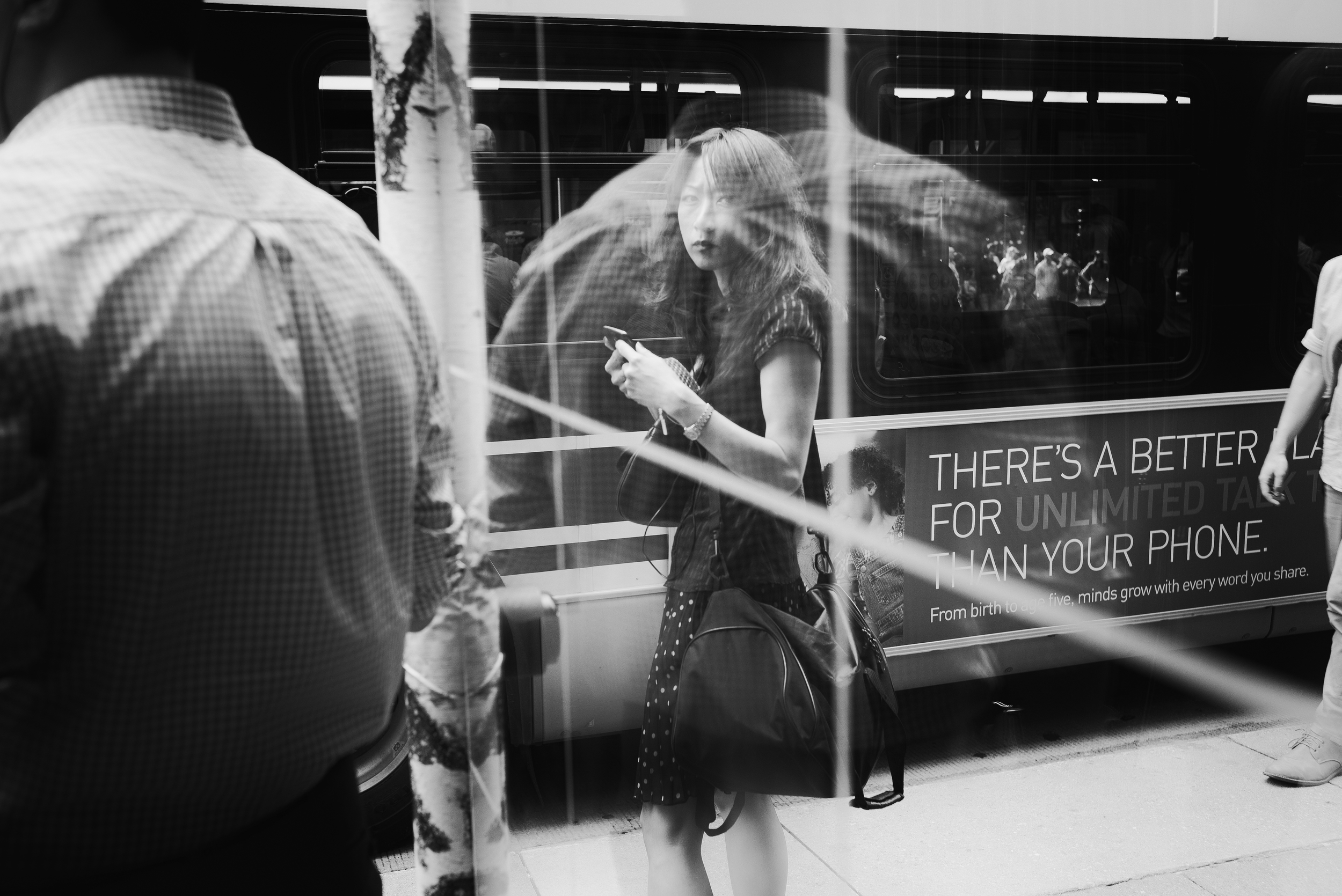
Connecting with eye contact
Direct eye contact can establish a strong relationship between subject and viewer. The traditional separation between art work and people viewing the artwork becomes blurred. The mind automatically connects with the eyes of the subject, as if an invisible line was being created between the two. This image is disturbing at several levels. First, the woman’s stare is definitely disapproving of the photographer – and of the viewer, by extension. This creates tension in and of itself. Secondly, the blurred reality created by the reflection of the man on top of her seems to play with our senses – disrupting the harmony of a traditional portrait, while requiring more effort to be understood.
Creating experiential moments
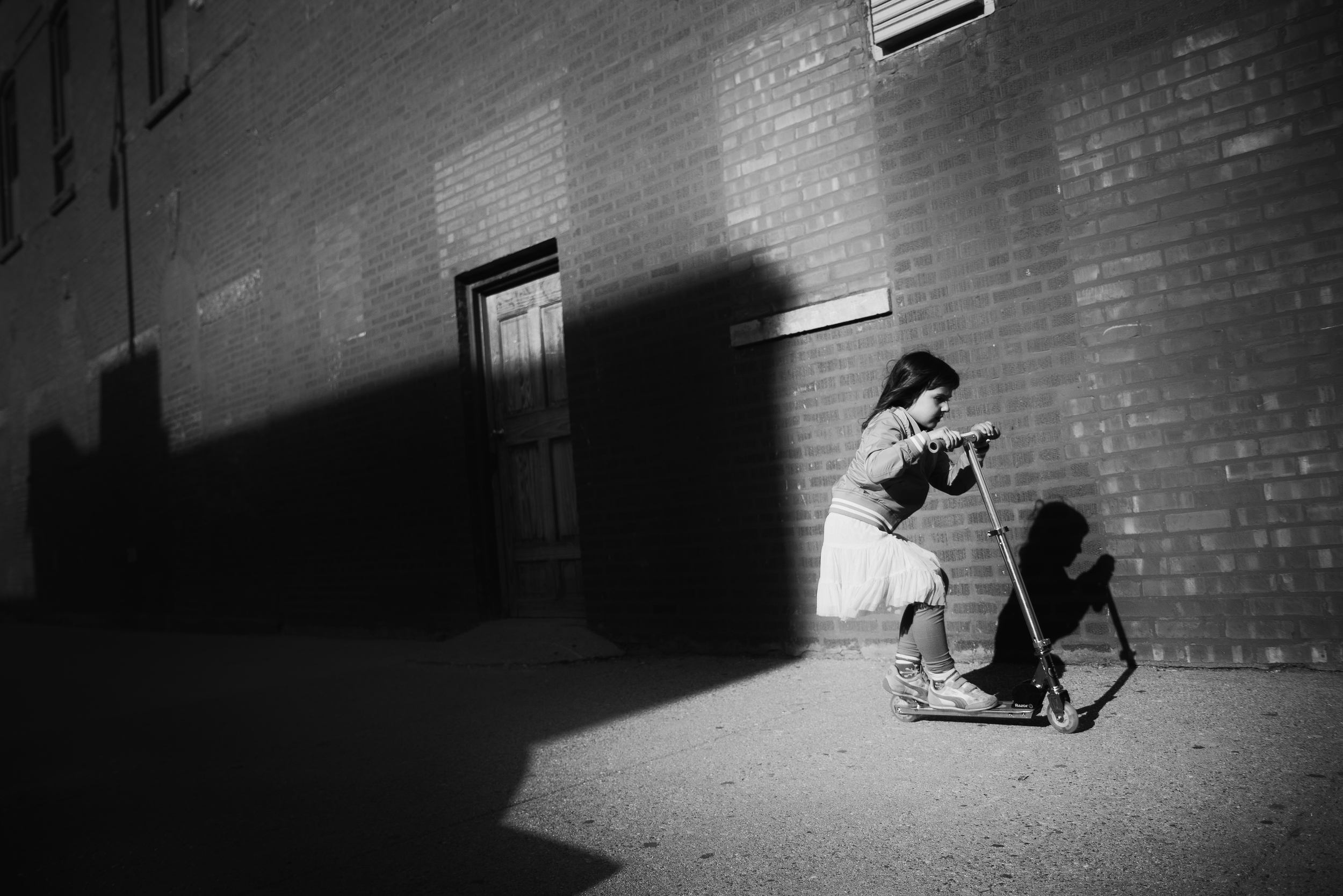
Subjectivity is a key element of dynamism in this image: choosing the right angles and viewpoints will get you a long way in creating unique pictures. The low-level angle at close range, coupled with a titled orientation, puts the viewer at the forefront of the action. Additionally, tension is created by the large mass of blackness that seems to follow her. Finally, the fact that the little girl is exiting the frame – not entering – suggests almost an escape, a frenetic attempt to run away.
3. Subject minimization
Traditionally, good composition is meant to direct the eye to the subject. Everything we do is aimed at separating the subject from the foreground AND background in clear, indisputable terms. Let’s think about what it means to break that rule: what if my subject cannot be easily distinguished from the environment in the photograph? What if your subject appear lost within their massive surroundings? Then discomfort comes in as the mind cannot properly process what’s going on. The original distinction between subject and environment doesn’t really exist – one and the other are interchangeable, part of a bigger scheme. It will demand more effort to understand your picture. And in many instances, more effort equals deeper interest.
Giving a sense of exaggerated proportions
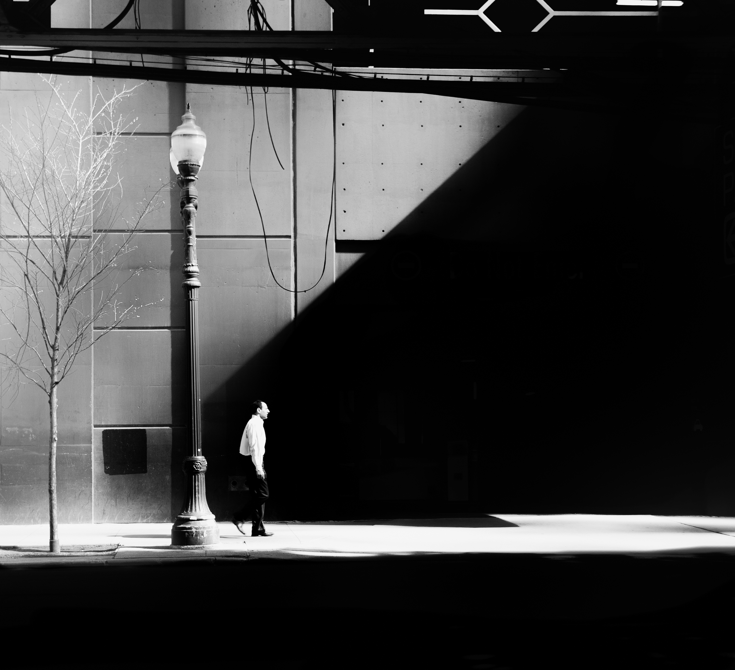
The image is all about exaggerating the proportions of the city in comparison with the subject. As you can see, the size of the lamp post as well as the massive triangle of pure black position the subject at the very bottom of an extravagant urban structure. The man appears lost in this urban jungle, faced with a never-ending wall of blackness, and surrounded by large pieces of steel. Even the tree seems frail and vulnerable compared with the tall lamp post. This resulting sense of scale adds tension to the image, suggesting that the subject is, in a sense, at the mercy of the overpowering city.
Blurring the line between figure & ground
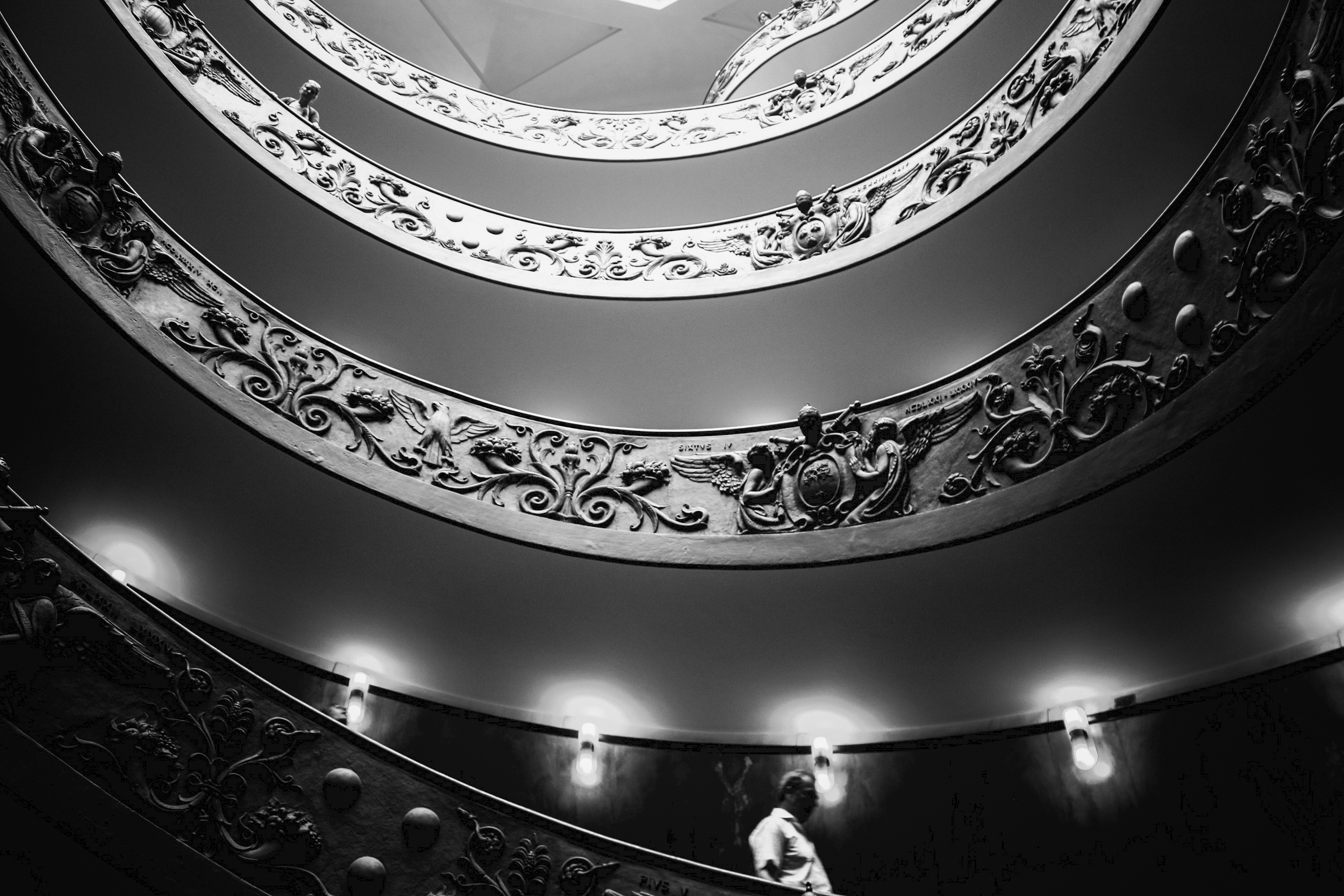
In The Stairs, the man is quite visible at the bottom of the picture. But as the eyes travel up to the top of the stairs, the difference between ornamental objects and human figures become increasingly blurred. Are these men looking down at us or are these vestiges of the past? Blurring the lines between figure and ground forces viewers to re-evaluate the image a second time – and perhaps, get lost in the labyrinth of possibilities.
4. Open-ended stories
The human mind needs closure. There is a need for a beginning and an end to everything. In fact, the human mind cannot easily tolerate gaps, nor can it be sustained with allusive answers. This is why playing on that weakness can be surprisingly successful in photography and art in general. The resulting ambiguity is intolerable, and in order to make sense of the whole, the mind is forced to fill in the gaps, making its own interpretation of the scene and the story. As we can expect, this requires effort, and effort means increased interest. And this is perhaps the most important insight to remember: suggesting stories can be far more impactful than simply telling them; it allows the viewer to make it their own, and their own only.
Keeping key elements in the dark
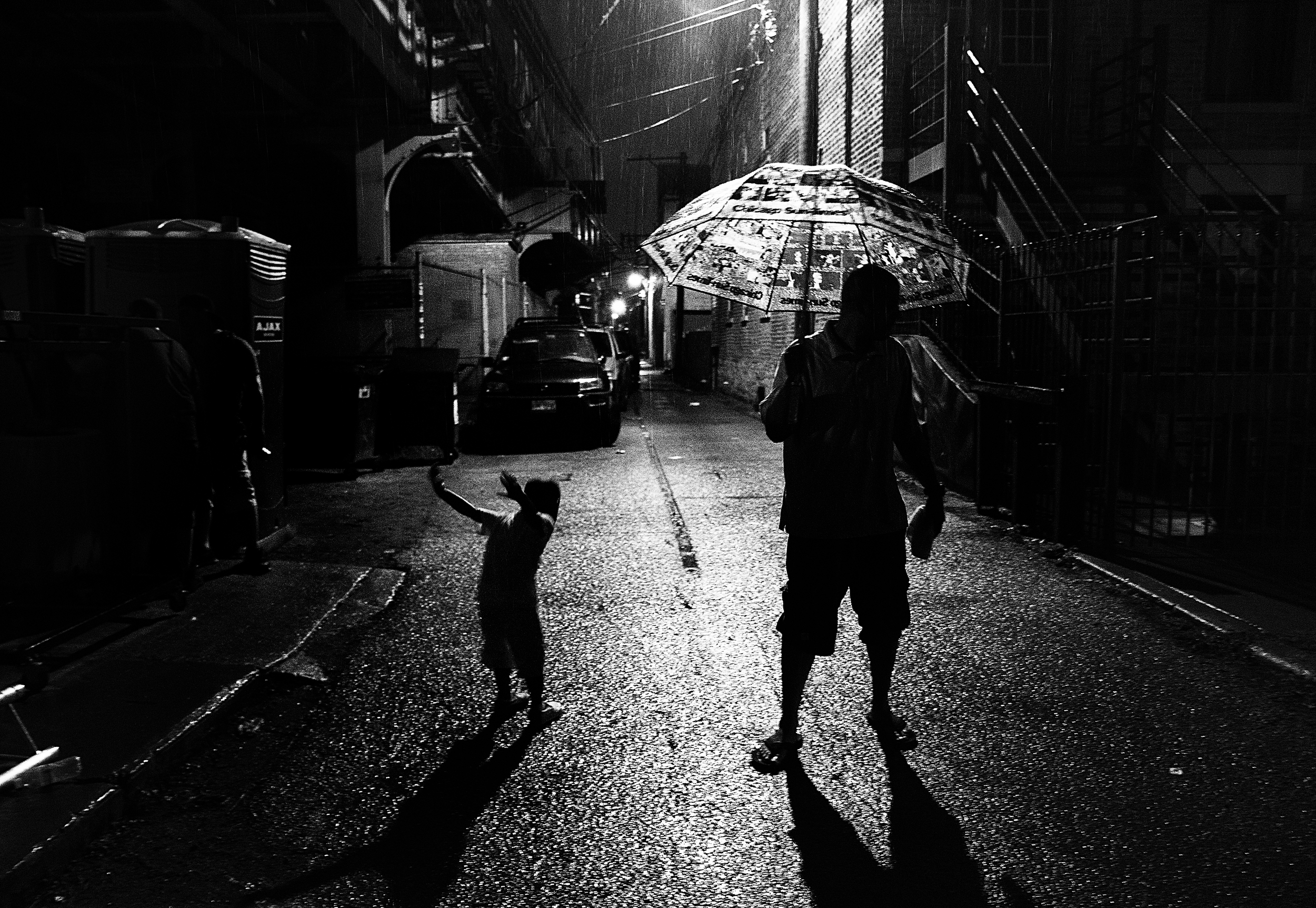
By hiding key elements of the scene, or key features of the subjects, we are in fact inserting gaps in the story – something that the mind cannot accept. This image has been interpreted in so many different ways, since I shared it publicly. The reason is simple: it only tells half of the truth. The subjects are mere silhouettes, whose expressions is hidden and can only be imagined. While the little boy appears to be jumping around, the gloomy light sitting across the dark alley conveys a feeling of ambiguity to the story – revealing too little to establish a clear and common storyline.
Not providing all the answers
This image doesn’t tell a story, it only suggests one. The subjects are looking up at something located beyond the frame, and for this very reason, the story remains a mystery. This results in a more engaging image, left to the imagination of the viewer. What can they be looking at?
There you go. This was the last chapter of my first eBook, Storytelling in street photography – Creating impact. Soon I will publish the second volume of this series, entitled: Understanding the human and city relationships, providing a unique perspective on composition and storytelling. Hope you’ve enjoyed the reading, and I wish you a lovely day full of photographic surprises!
