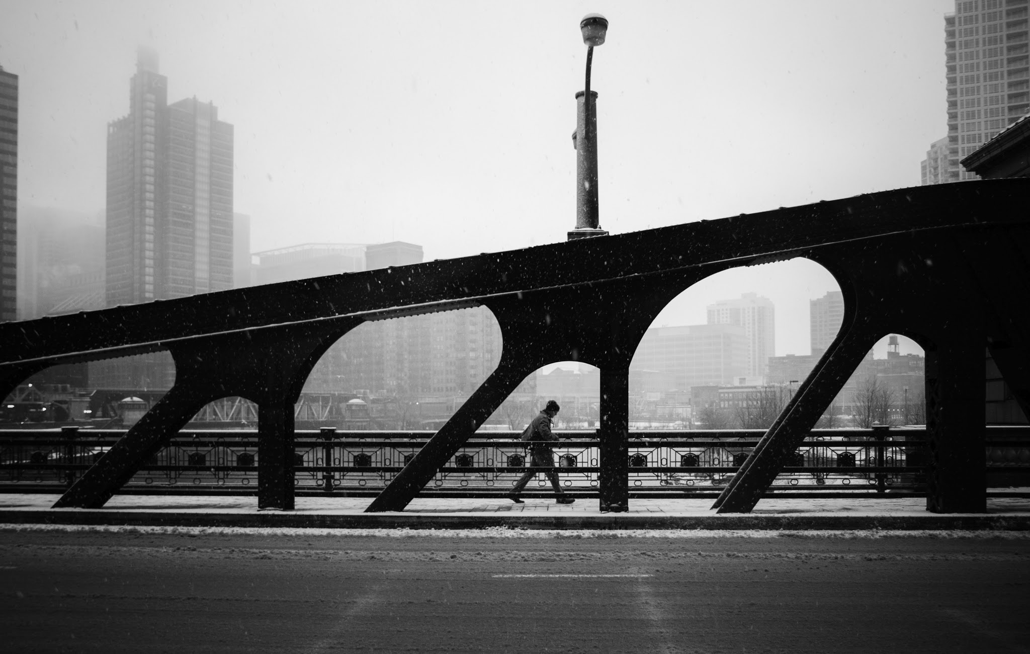
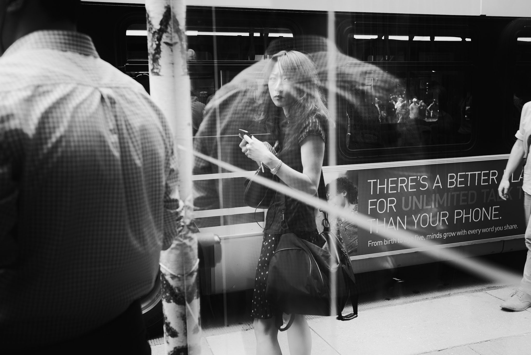
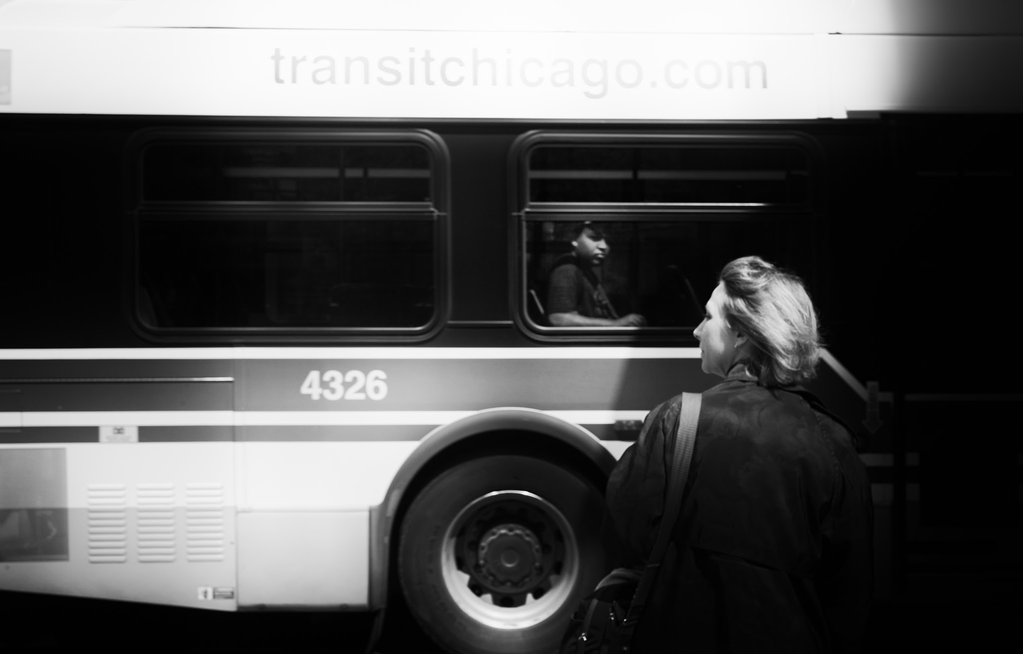
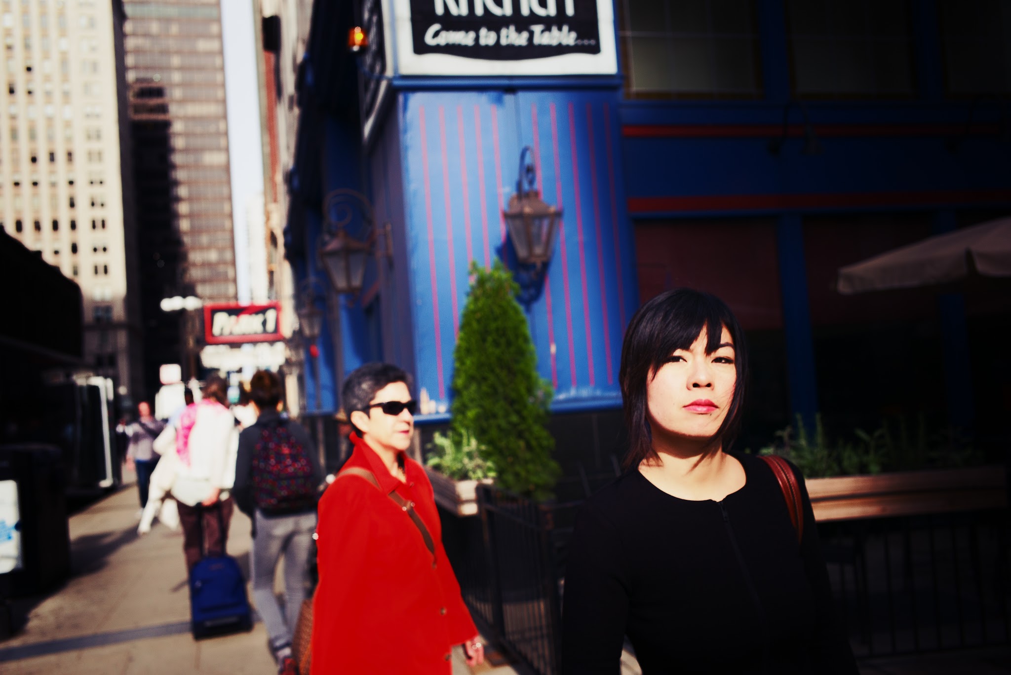
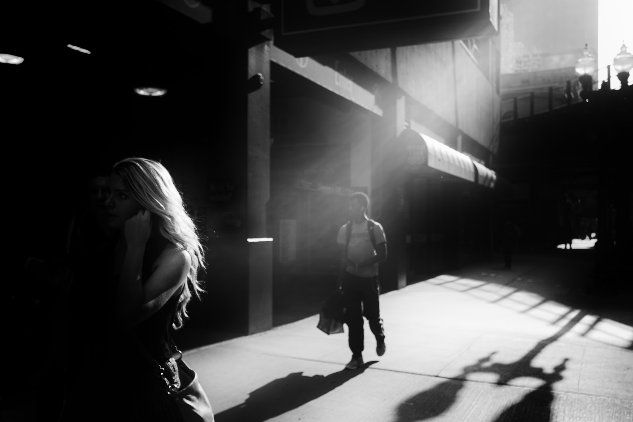
Here you go, the new episode of Street Focus, the podcast hosted by Valerie Jardin, is all about Chicago, where, when and what to shoot in this wonderful city that I know only so well. So go listen it if you have some time!
blog posts
street photography tips, london street photography, london photography
Tales of overshadowing cities
Cities and people have always been fascinating to most of us. Of course, street photography is about people. But more often than not, the city lies behind to tell a story about these people, as if the city could reflect and emphasize what’s going on inside us, perhaps telling more about our dreams and fears than the longing human silhouette already escaping the frame. While both urban and human elements have their own vital importance in creating interest and uniqueness, I believe that this is at the intersection of both elements that lie the greatest stories being told. To the same extent as light cannot exist without dark, it often seems to me that human and city elements are indivisible – they not only complement each other, they in fact converge to tell a more complex, more powerful story of humanity.
As a first step to understand the city-human relationship, we will discuss the case of minimalist urban landscapes where the city plays a predominant role, minimizing human beings as part of visually simple or complex compositions. As we will see later in this post, the opposition between soft human shapes and harsh urban lines is not only visually pleasing: it can convey strong emotions to your viewers, and can help us understand the complex relationship that connects people to their city.
Giving a sense of scale: the minimalist approach
Minimalist compositions in street photography look at integrating human elements into an existing urban landscape, and can range from overly simplistic to complex visual compositions. The key of minimalism is to create a sense of scale, of proportion between people and the city itself, and then to purposefully minimalize the space taken by the human element compared to the city elements.
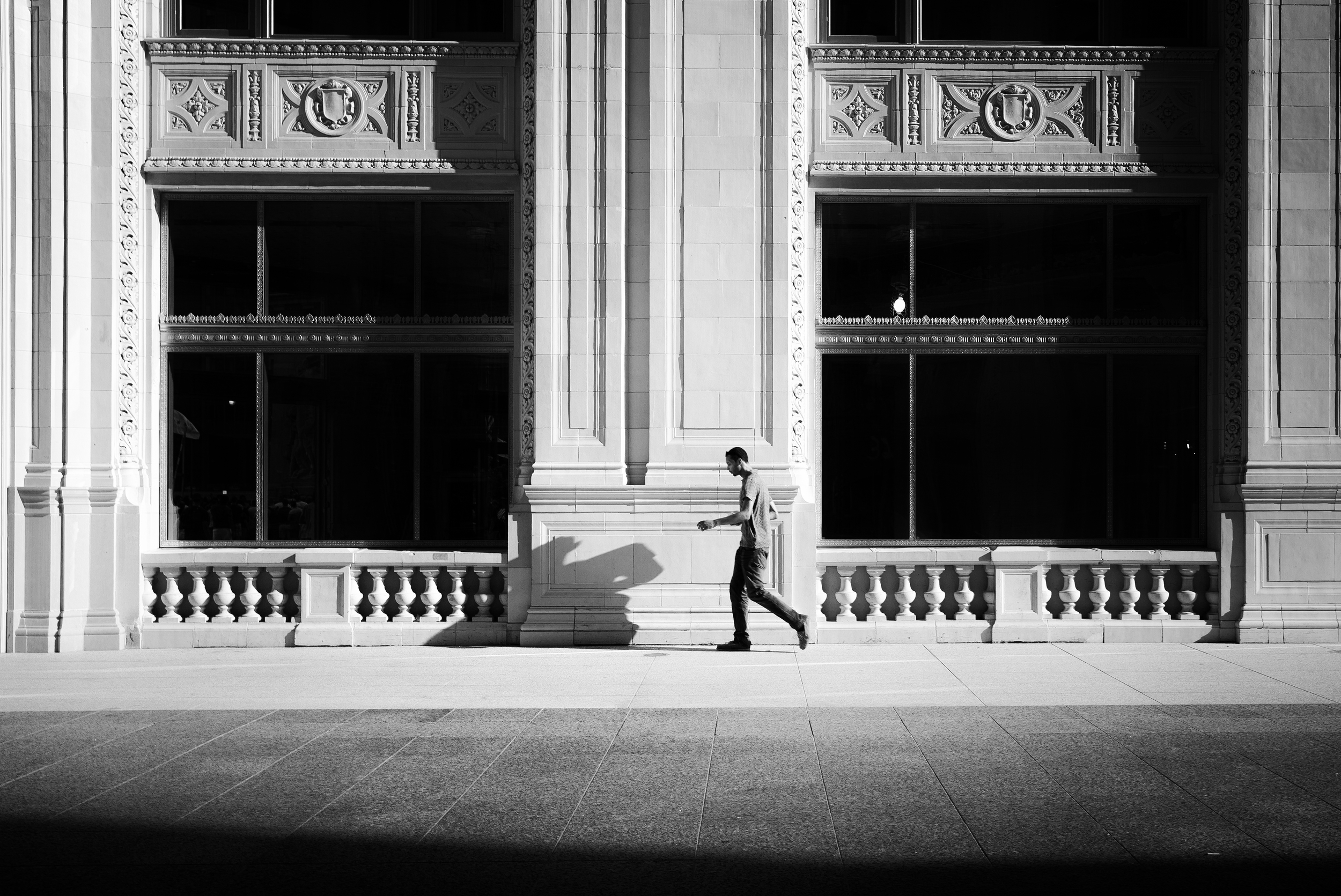
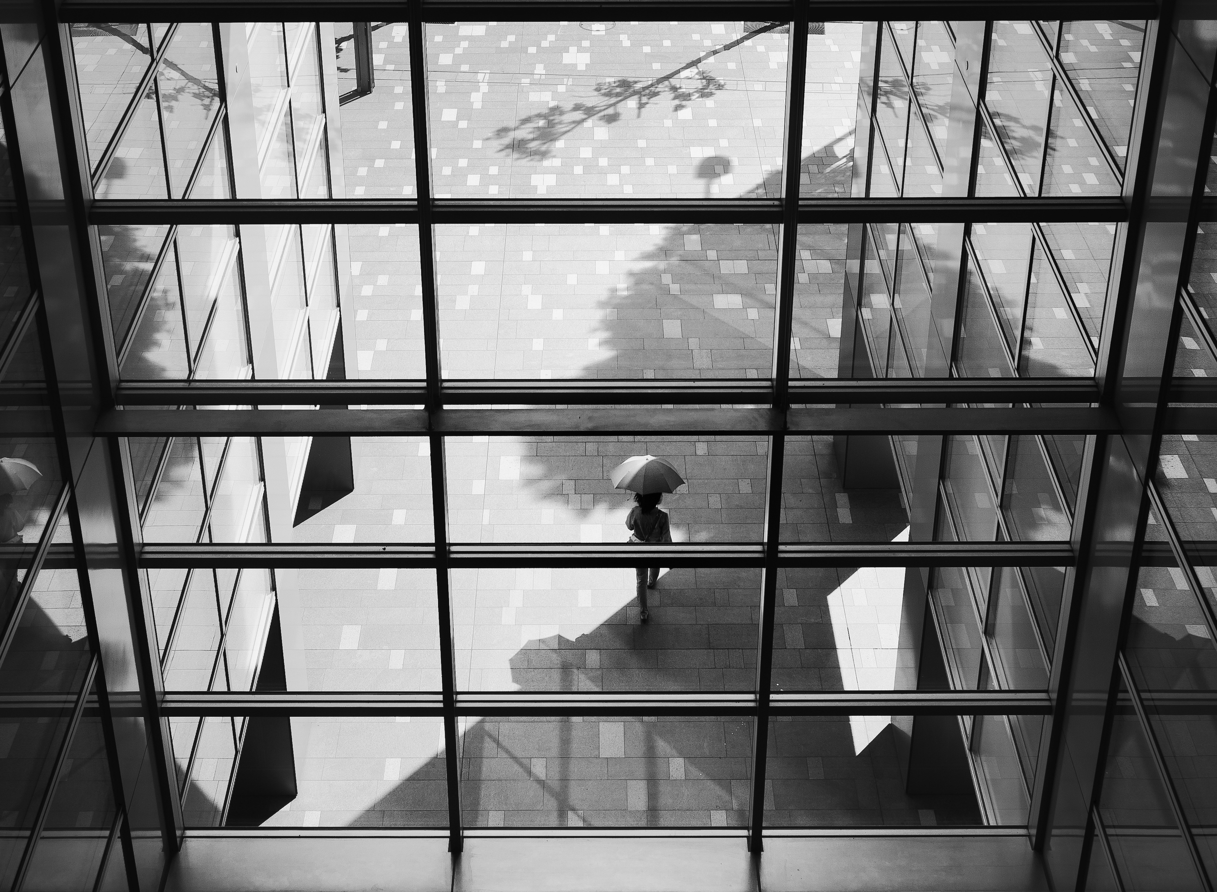
The first image is an example of a simplistic minimalist composition, made of a person walking alongside a huge building. These types of shot will require large focal lengths, to take in as much of the surroundings as possible. The resulting image is as simple as it can get, almost naked – with that man walking by himself and followed by his shadow. This second image shows a more complex visual composition – while easily recognizable, the human element shown as an umbrella is surrounded by many shapes within shapes, some forming patterns, and some breaking existing patterns to add more complexity to the whole image. In both cases however, the human element is definitely reduced to a minimal form, giving birth to the so-called minimalist street photography.
When looking for a suitable background, you can find many candidates throughout the city. Arcades, because of the sheer size of the architecture and the appeal of its symmetrical making, can be a valuable starting point. With arcades, it is easy to integrate human elements at the right time and the right place: either in the continuity of the arcades, like on the image on the right, or on the contrary, placed in an unusual location for a more surprising outcome, like on the image on the left.
But minimalist compositions can play with an infinity of shapes and lines to exist. Look right in front of you, on the other side of the street, for interesting structures that can provide an extension to human beings walking in the city, such as this image of Chicago South loop on the left. Or focus your attention on the facade of a building with transparent stairs – where the human element will be breaking the pattern, all at the same time disrupting the balance and strengthening the superb geometry and details that city backdrops can provide.
Highlighting the human element: of light and composition
There are two ways to emphasize the human element in a minimalist composition: through using light to create distinct contrasts and tones, and through composition and framing. The key to those compositions is to highlight human beings just enough as to take them out of the ordinary chaos of cities and urban settings. Simplicity is important here, as too many prevalent elements may dilute your stories and pose a challenge to your viewers. If they are not able to identify your subject(s) right away, the impact of your picture may be somewhat lost on them.
First, light is everything. Tonal and color differentiation in minimalist compositions is a must, not an option. In this example above, the man stands out because of the subject’s central placement – where the light and color values are stronger, and thus able to instantly attract the eyes. The vertical lines surrounding him also act as a blocker, isolating the space around him from the remaining of the scene, at the spotlight of a theatrical stage. All other city and human elements are faded in comparison, creating more complexity, but at a level that the mind can comprehend and accept.
Secondly, leading lines drive the eyes to the subject in a non-hesitant manner. Those compositions are generally more simple and straightforward to the mind, with a clear, well defined path to what the eyes should be seeing. It also creates depth and perspective, thus making the image more interesting overall. Central positioning within the frame also makes it easy to understand the story in the picture. All in all, each composition element in this picture is meant to achieve one simple result: lead us to the main character, at the intersection of several geometrical planes.
Leading lines though can be less obvious and more subtle to the mind, like in the above example. Here, the line is diagonal, starting from the right and slowly taking us to the silhouette of a woman. What also works in this image is the strong tonal contrast between the subject and the immediate background where she stands, making her the ultimate subject of this black and white urban landscape. This image however doesn't stop at the woman, and is an example of how the city can extend well beyond human beings – showing how small we are in the larger city surrounding us.
Understanding flows: creating movement and dynamic
Minimalist compositions lend themselves to interesting visual puzzles, at times static, and at times strangely dynamic. When one understands flows, then it becomes easy to capture your subject in a dynamic setting. First of all, as you probably know by now, the eyes go from left to right, and from bottom to top. This is how the mind works – and everything going against that flow may be disturbing and strangely unbalanced. The first two pictures below are adopting a similar pattern: they all showcase characters on their way from left to right, at various position within the frame. But the dynamic is not created simply by this directional movement: it is the utilization of city elements to strengthen that movement that will be decisive to create dynamism.
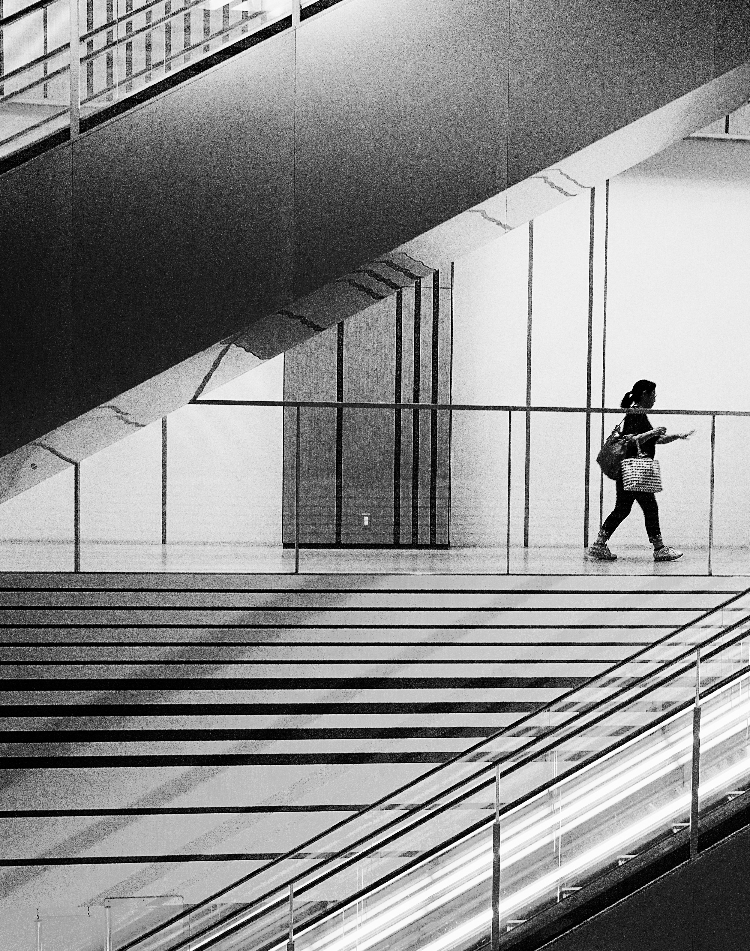
In the first image, the disappearance of the subject from the frame is aggravated by the strong diagonals created by the elevators around her, following a left/bottom – top/right direction. Those diagonals are some of the strongest elements a picture can have to create invisible flows and very real sense of movement. All the lines tend to follow and support the subject’s movement, emphasizing a clearly defined sense of motion and directionality.
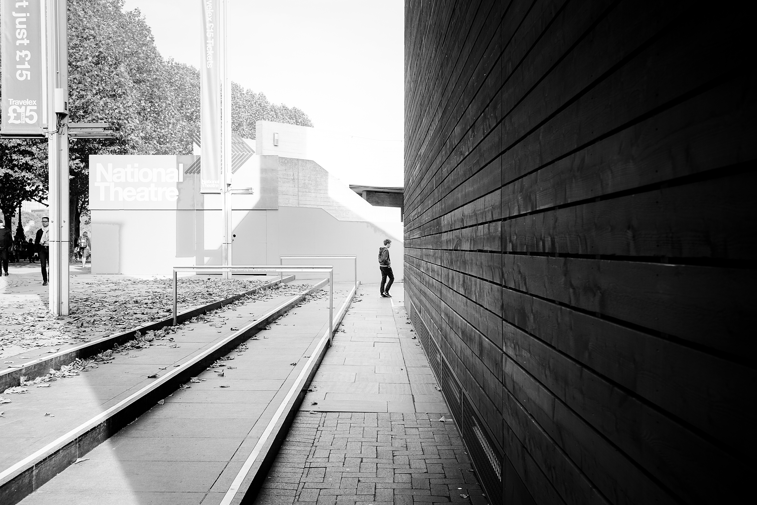
While more abstract, this second image follows a similar flow with a main character being absorbed by the black mass of shadows. Again, a strong diagonal cuts the image in two, connecting the man to some outer part of the image situated in the top-right corner. This connection creates movement per and in itself, opening up the image to some unknown destination for the mind. The resulting effect is the anticipation of the man moving into the dark space, preventing the image from feeling otherwise static.
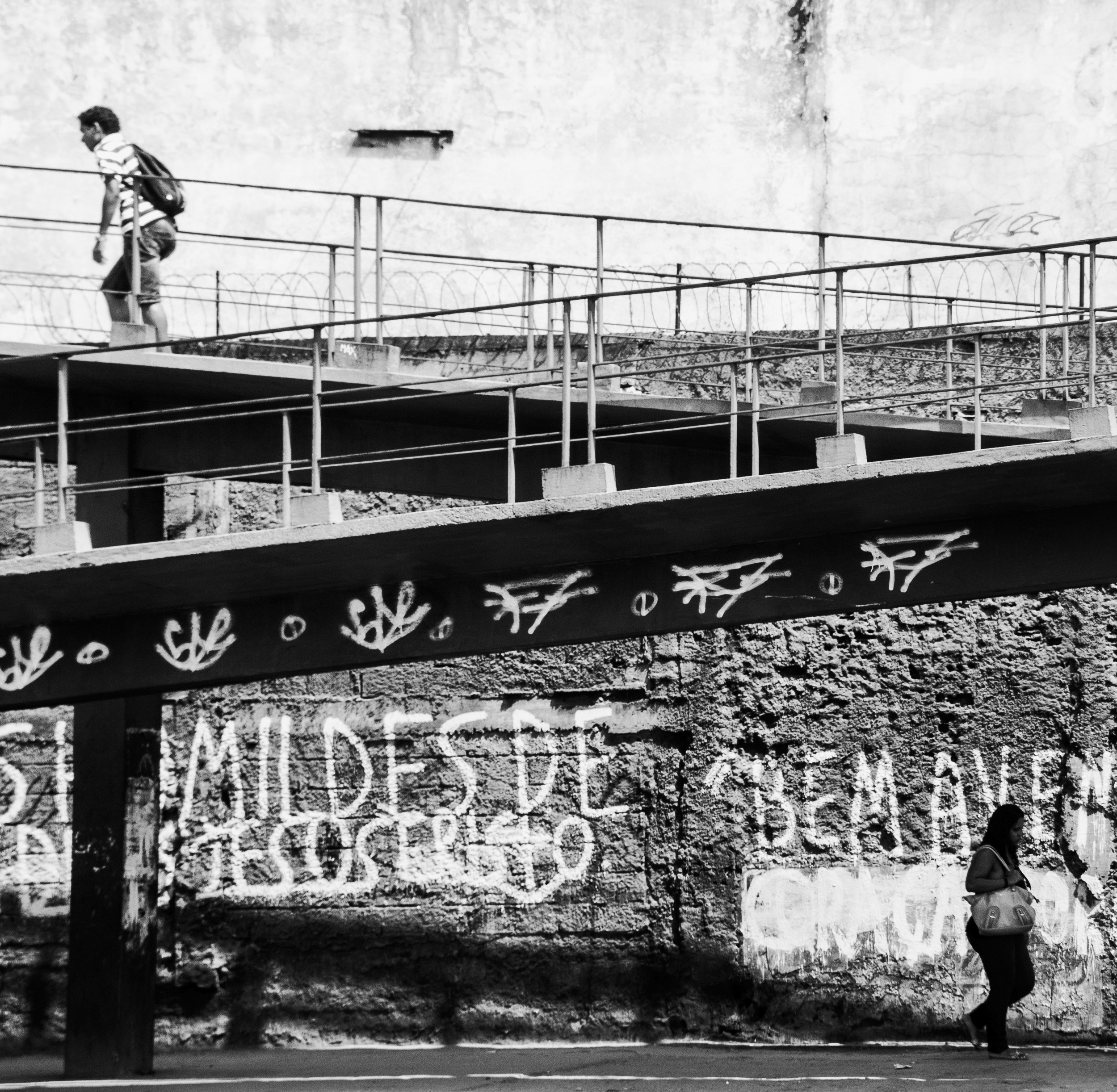
Another technique is to present two subjects going into separate directions, as in the image above. Here, the combination of those opposite directionalities with the bridge that connects and separates all at the same time creates a sense of fragile imbalance, not unlike a scale that one would use to weigh different objects. The image becomes very dynamic, full of opposite forces driving in multiple directions at once – creating complex flows in the image, and resulting in a clear sense of opposite movements.
Towards abstraction: playing with shapes and space
Minimalist compositions can, at times, be highly abstract. While in most images, human shapes are seen as distinct from their urban environment, we can easily take the opposite direction and minimize this distinction to create more abstract and visual compositions. Looking back at the way people perceive images and components of a story, the basic distinction between subject and ground (meaning anything else surrounding the subject) is particularly important in enabling them to understand the story going on. But why would we want to make it easy? At times it can be fun to create visual abstractions where the human element cannot be easily understood, seen, and spotted. This often results in more complex and surprising images, requiring more efforts from the mind to decipher the visual puzzle created.
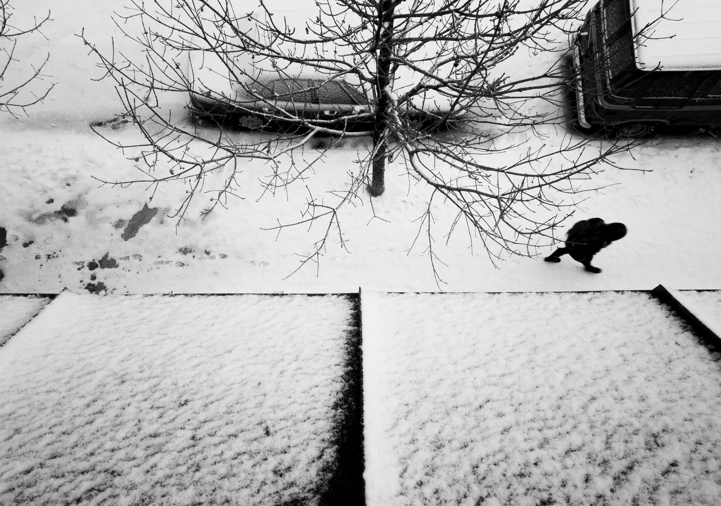
As an example of abstract urban landscape, here’s a shot that I took from my window back in the time I was leaving in Chicago. As you can see, the angle and elements make this shot highly abstract. It is hard at first glance to recognize the setting: a sidewalk, a tree, a car, and a man walking in the snow. The dark human shape seems to belong to the mix of abstract elements making up this shot.
This shot of the Vatican stairs take the abstraction a step forward, through blurring the lines between human and architectural shapes. If you’ve followed my different posts and book writings, you will easily recognize this example. If not, here’s what there is to see: the human heads and sculpture heads are hard to differentiate, making it a puzzle for those looking at this image. What’s alive and real vs. what’s in stone and from the past cannot easily be distinguished, creating a sense of abstraction.
This last shot shows an example of using negative space and light in order to create a perfectly abstract composition. The role of human elements in this picture is less and less clear, as those elements seem to merge with their surroundings. The delimitation of buildings is non-existent, merging into space of bright light and dark shadows alternatively. The resulting image is made of dark and light elements reconstructing a scene that doesn’t exist, with buildings that are not what they seem to be, and a place that we can’t easily recognize.
Emphasizing emotions: unveiling the human-city relationship
The most interesting use of city elements is to emphasize emotions in our stories. Although harder to create, and with no clear rules to follow, here’s an attempt at identifying the various emotions that can be emphasized through minimalist compositions – when the gigantic city overwhelms human beings and reflects part of their deeper feelings.
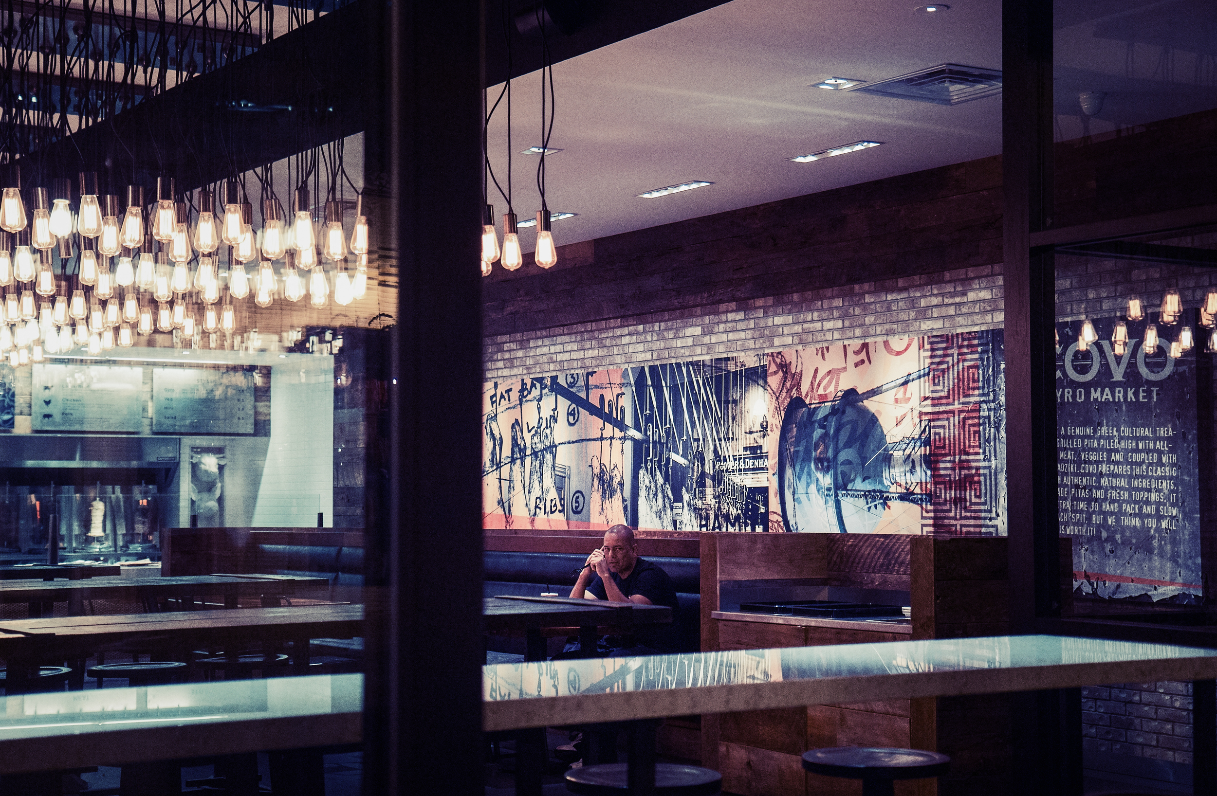
Urban loneliness is one of the most common emotions that minimalist street photography can convey. In general, lonely figures lost in the chaotic urban landscape generate this type of emotions. This is the case for example of the image above, where a lonely man sits in the middle of an empty restaurant at night, leaving us wondering where all other patrons may have gone.
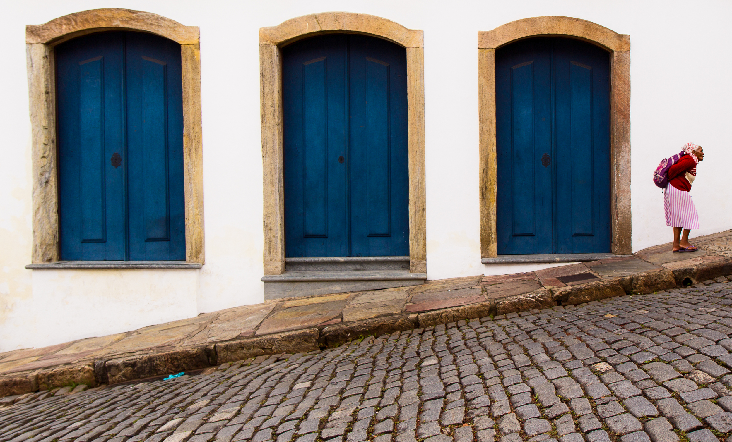
Sometimes, rather than loneliness in itself, this is the feeling that the whole weight of the world falls on our shoulders, like in this image of an old woman having climbed a hard and steeped road despite her advanced age. The connection between the city and this character is made stronger by the form of her back, rolled over, and the patterns of high blue doors seemingly of another age and time.
But our relationship to the city can also be mystic in essence. In this image, the human drama happening between the two lovers is emphasized by the voluptuous city playing in the background, as if they were on the edge of the world – hidden from the city, and yet an integral part of it.
When subjects become active observers of the city, other emotions can come to life: such as awe in front of sheer beauty, of the complex and timeless work of man displayed in front of their eyes. In this image of Chicago architecture, the couple under the umbrella appears mesmerized by the view laying down in front of them. They’re in communion with their surroundings – feeling part of the city, and inspired by its timeless history and strength.
Creating impact: Fundamentals of storytelling in street photography
Here you go, I have made the jump. I finally published my first book, developing the concept of storytelling in street photography. I spend almost two years studying composition in street photography, with the purpose of understanding how to create more emotional and impactful images. I was interested, in particular, in the concepts of harmony vs. tension, camera subjectivity, and light transformation - all recurring patterns in my work.
From this analysis came to life a series of blog posts, and, eventually, a conference talk on storytelling in street photography during the Out of Chicago conference. This is my honor and pleasure today to share with you the result of this analysis; and I hope that this book will take you further in your photographic journey, just as it did for me.
This ebook is available for free at the following link: Issue/Marielaigneau and you can also directly download it here.
PS: If you enjoyed the reading, can you let me know by adding a comment below? It would make me very happy :) Thank you in advance!
Self-imposed constraints: the key to creativity
Most people will argue that gears don’t make you a good or bad photographer. And they are right. But gears – your choice of lens, of camera body, of filters if any – determine what you can do, and define limits within which to operate your art. And in that sense, it is bound to make you a better photographer in the long run if you operate long enough within those given constraints. Besides gear itself, an artist can impose on himself many constraints, whether knowingly or not. Take for instance landscape photographers. Their constraint is time-related: they will wait until the light is just at this perfect point before taking a picture, maybe a few more, and then go home. A portrait photographer will be constrained by natural light, which he will try to complement with artificial light as able. Still, evolving within the constraints that we give ourselves shape us as an artist. It stretches us to achieve more with what we have and can do. Because the room of possibilities is reduced, our attention is way more focused that it would be otherwise. And this, in essence, is liberating.
I have been using my Canon 60D with a 17-55 zoom lens with f2.8 in continuity. This camera and this lens totally shaped my photography of the past year – literally defined what others call my style (even if I am unsure what this means!). Let me explain: zooms are versatile, but in street photography, only one variable can be adjusted before the target goes away. Mine was the focal distance. Everything else was set. Aperture priority at f2.8, as I felt that smaller apertures were not fast enough. And, the ability to rely on autofocus (or to miss my shots because of auto-focus).
Image taken with Canon 60D @ 55mm
I thus spent my entire year dealing with autofocus, maneuvering my frames between 17mm and 55mm alternatively, and getting something out of it. I operated within those constraints, knowing what shots would work, what would not. Knowing perfectly what I’d get at 17 vs. 55 in my frame (all other focal distances were never used for that matter). Learning to point the focus where needed before recomposing etc. Why it was liberating: I knew perfectly well what I’d get and I did not need to worry about anything else. My resulting shots were soft, with shallow depth of field at 55m, and pretty large depth of field at 17mm. Because my subjects could see me coming from far away, I was also constrained by the types of scene that I could take – and the distance at which I could assumedly go without having their expression change. I thus alternated between long-range shots of solitary figures vs. stolen street portraits of one individual (right in his face type of shots).
Image taken with Canon 60D @17mm
When I started to use the Leica M with a 35mm lens, the constraints stayed, but they changed in nature. And thus has my photography. It is still very early to describe that change, and how it evolve in the past months or so that I have been using this wonderful combo. But that change is clear, evident. I can experience it throughout the way – from the way I see the world, to the last post-processing touch that I would apply on an image. It is transforming me, slowly, but effectively. It is opening doors that I had never seen before. It is also frightening, because I don’t have a clear sense of the direction that it is taking. I know what I am leaving behind, but not where I am headed at.
- I am now forced to see within a specific, fixed frame – 35mm – whether or not it is appropriate to what I see. This is forcing me to change the way I see, to make it appropriate to the frame. I thus need to reverse the thinking: and the way I feel my environment. The window is blocked, I cannot extend it neither can I reduce it. My creativity needs to adjust to this new state of things. As a result, I feel that my compositions are getting a little sloppier, less rigorous, more chaotic. My subjects are well centered, but the borders are non-defined – continuing to extend to parts of people, parts of faces. And it seems that I am not ready to crop them out, since in a way, they belong to the frame just as much as my subjects.
Image taken with Leica M @35mm
Image taken with Leica M @35mm
- While in hyperfocus mode (anywhere from f6 to f9), which is the most liberating of all modes as a street photographer, the constraint of subjects and scenes become very real. On the one hand, nothing is ever out of focus, which is a novelty to me (used to have f2.8 as my go-to aperture). On the other hand, it requires me to understand everything happening in the frame. The simplicity that I used to achieve with f2.8 is definitely over – I capture a world of complex interactions, foreground and background exploding of details, opposing and yet, continuing one another. There is no clear separation anymore. This state of affairs forces me to consider my background much more carefully for street portraits, and generally, mid-range shots. In other terms, I now need to consider layers – layers of people and things. When everything is in focus, you need to see in 3D, not in 2D. And this is a big change for me.
Image taken with Leica M @35mm
Image taken with Leica M @35mm
- If constrained by the need for speed, such as at night, manual focusing requires me to anticipate much more than what I used to do. It forces me to go upfront of people, almost chasing them to get at the right distance. My brain is wired on measuring: measuring the distance between me and the subject. Measuring the steps that it’d take to get closer, the risk of being seen – and thus changing the expression, the risk of missing the moment forever. It becomes an evergoing assessment of risks and possibilities. Yet the results can be stunning. The different mechanisms behind manual and autofocus lenses dramatically alter the experience, each having their sets of requirements to follow. It is like taming a new animal – it is all new, difficult, foreign, yet full of possibilities.
Image taken with Leica M @35mm
Yes, constraints shape our artistic vision. They shape who we are, as an artist, as a photographer. But the key to success is to persevere within a given set of constraints - not to give up too early, but to let the time for the mind and the body to understand those limits, and, later on, to overcome them with greater creativity.
The world of Leica: my first impressions
Leica, and rangefinders in general, are so different from what I’ve experienced so far. It really is a world of its own, a million miles away from traditional DSLR photography. Clearly, each serves a different function, and I can say for certain that some people will totally dislike it. Well, I loved it.
It’s been four days since I purchased the Leica M, and I had the opportunity to shoot pretty much every day since then. I’m barely discovering its possibilities, so far, but I have seen enough of it to share a couple of thoughts with you J
The experience is what makes all the difference. Yes, it is really awesome to shoot street photography with a Leica, and for very simple reasons. First, it is so light compared to a DSLR. Heavy enough to be stable in my hands, but light enough to carry around everywhere. I wanted a camera that I would not hesitate to bring with me… And I found it. Secondly, it makes you look invisible and / or not very threatening. People look at you with curiosity, and smile at you. Why, in Chicago my friends, where everybody can see you coming from everywhere, this makes a world of difference! I can all of a sudden get so close to people that this is fantastic. Thirdly, the viewfinder that never blacks out is a pretty awesome part of the experience. I am not a “decisive moment” kind of photographer – I generally frame and isolate one subject carefully, and often don’t get it wrong (if autofocus doesn’t screw up that is). But now, I can also, if I want to, extend my photographic subjects to particular expressions, configurations etc. And I feel part of everything J Which is a very nice feeling indeed!
Pictures are beautiful, lens is so so very sharp. Really. I was so impressed with the raw files generated by the camera – so sharp, and the colors are incredible. To be fair, I can’t compare with my Canon lens since I have used it at f 2.8, which is the largest aperture. I didn’t try f6 or 7, which would have, no doubt, resulted in greater sharpness. However, those raw files are still spectacular, and at very large apertures as well. The color files have that unique look, nearly vintage, that really makes me want to do more colors J
Manual focus is hard, but rewarding – when light is good. I realize that the world is made of endless possibilities that I had never seen before. Of course, I screwed many shots – particularly when I wanted to change focus distances in an instant. But I am getting better, and zone focusing is a pretty unique way of doing street photography J I can see some limitations of course. I was not that impressed with Leica in low light conditions. I think that night street photography will be a challenge, as I can’t yet estimate distance very well. Choosing f2 is out of question, the margin of error is inexistent and my subjects will be way too often out of focus. The ISO capabilities, as you probably know, are very limited compared to DSLR, so do not count on it either. Another limitation is the semi-automatic mode. Leica does make pretty strange decisions as far as ISO and speed are concerned. It is especially difficult in an environment where there is a combination of dark and light zones (such as under the tracks of the L train in Chicago). Most often than not, the exposure was totally off, and the speed was too low. You can of course set parameters for Leica to operate: max ISO, max exposure time. We will see if that makes it better, but overall, I do think that Leica is manual in essence. Which for street photography can be a little hard at times.
In conclusion, Leica forces me to change the way I do photography. I usually use a very large aperture in autofocus, with a zoom. I now have to do with 35mm and apertures that do not allow me to isolate that well my subjects. On the other hand, I am discovering the joy of pre-focusing, where the camera never hesitates – where the focus is just as good as you’ve set it. Is there still a place in my heart for my beloved Canon 60D? Yes, of course. I can’t get those awesome bokeh shots on the street with Leica, not without autofocus for now. And I can’t quite do street photography at night either, as far as I have seen (but that may change when I become better J). But the world of rangefinders make everything a lot more worthwhile in a way. It comes back to the essential, and it lets you in, right into the scene, as if you had never left it.
I wanted to go full frame. Leica was the obvious choice for me. And that was a wise, wise decision that I don’t regret at all.

